
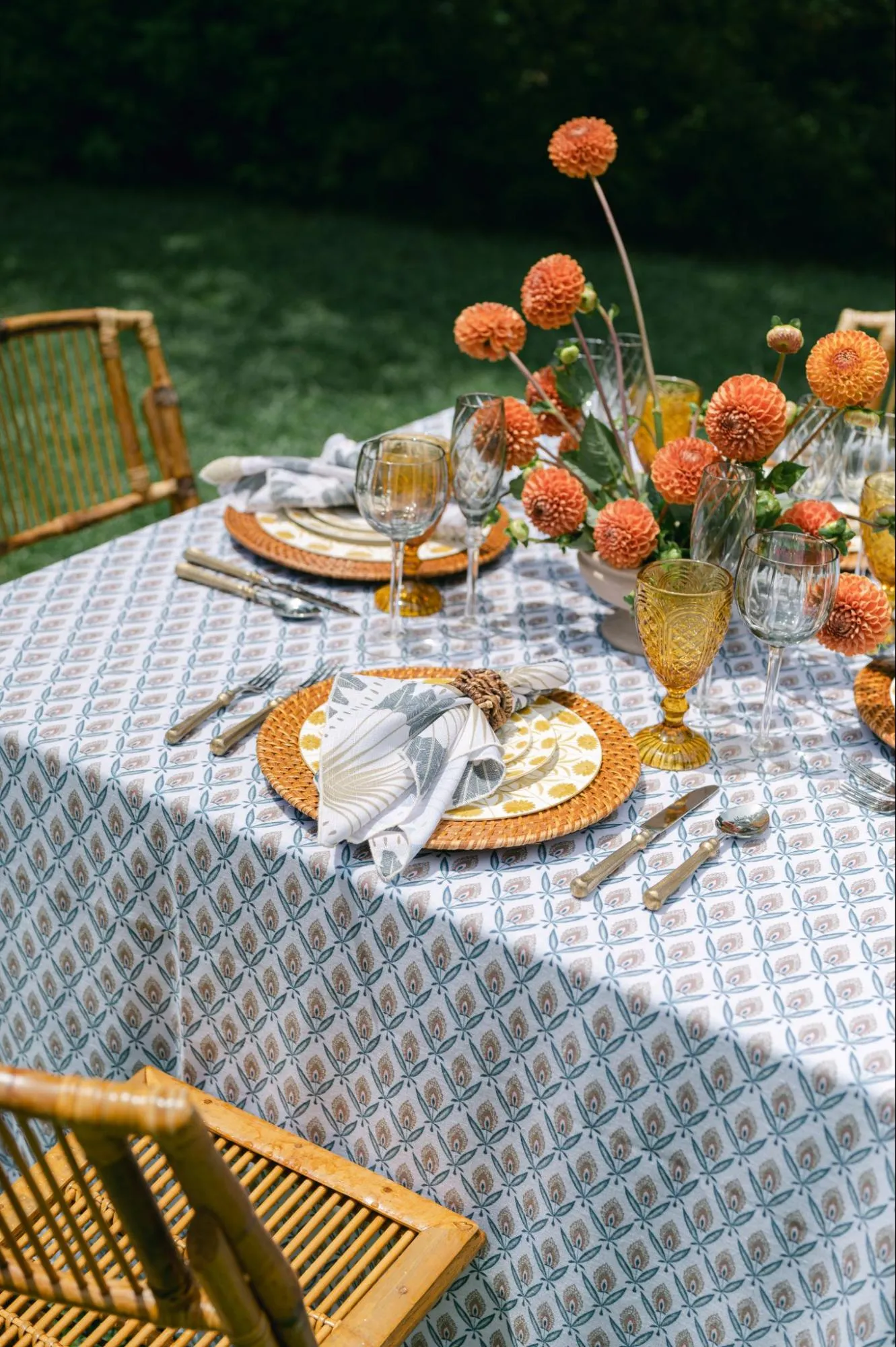
Jewel tones are naturally suited to formal fall events. Burgundy, emerald, sapphire, and plum bring depth to a room and respond beautifully to evening light, layered textiles, polished metals, and sophisticated tabletop details. Their richness can make a gala feel appropriate for the season without relying on literal autumn motifs.
The challenge is knowing when to stop. When several saturated colors compete across linens, furniture, glassware, florals, and décor, even an otherwise beautiful palette can begin to feel heavy. A more refined approach starts with one dominant jewel tone and gives it enough neutral space, material contrast, and visual restraint to stand out.
For fall galas in Washington, D.C., the venue should also influence how much color the room needs. Historic interiors, contemporary event spaces, formal ballrooms, and tented settings all create different backgrounds for rich color. The strongest palette responds to those surroundings rather than applying the same combination everywhere.
Choose One Jewel Tone to Lead the Palette
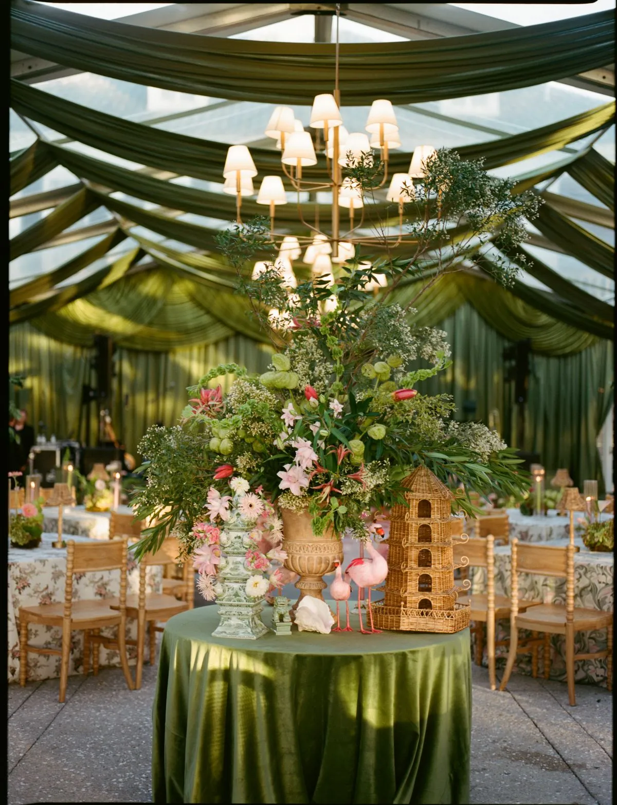
A jewel-tone palette becomes easier to control when one color establishes the primary direction. Additional shades can still appear, but they should support the lead tone rather than compete with it.
Choosing one dominant color also creates a clearer framework for linens, furniture, tabletop pieces, and metallic finishes. Instead of asking whether every beautiful jewel tone belongs in the room, planners can evaluate each selection against the color that has already been given visual priority.
Build Around Burgundy for Warmth and Depth
Burgundy is a natural starting point for formal fall events because it has enough depth to anchor a large space without relying on bright seasonal color.
Its visual weight means it often works best alongside lighter or quieter companions. Ivory, warm stone, champagne, dark wood, and restrained metallic finishes can give burgundy enough contrast to remain rich rather than overwhelming.
The amount of burgundy matters as much as the shade itself. A full burgundy linen creates a large field of color, while burgundy napkins or upholstered chairs introduce the same direction in smaller, more controlled doses.
Use Emerald When the Event Needs Stronger Contrast
Emerald brings a different type of richness to a fall gala. It feels saturated and formal but is less expected than traditional red-based autumn palettes.
Because emerald can have significant presence, lighter neutrals and clear surfaces can help keep the room balanced. Ivory china, transparent glassware, warm metallic details, or soft stone linens can provide enough visual relief for the green to remain the dominant statement.
Emerald can also work particularly well when the venue contains warm wood, stone, or architectural materials that naturally contrast with its cooler depth.
Let Sapphire Bring a Cooler Direction
Deep blue offers planners an alternative to conventional fall palettes while still providing the richness associated with the season.
Sapphire can feel especially polished when combined with ivory, warm gold, champagne, or candlelight. Those warmer elements keep the overall environment from becoming visually cold while allowing the blue to maintain its clarity.
In contemporary spaces, sapphire can also create a sophisticated relationship with glass, black framing, silver-toned surfaces, or clean furniture silhouettes.
Use Plum or Aubergine as a Softer Alternative to Burgundy
Plum and aubergine provide depth without carrying quite the same traditional association as burgundy.
These tones work well with taupe, warm gray, bronze, muted blush, or charcoal, depending on the level of contrast the room needs. Because purple-based shades can shift noticeably under different lighting conditions, the surrounding fabrics and finishes should be considered alongside them rather than selected independently.
A restrained plum palette can feel particularly refined when texture provides the secondary layer of interest.
Give Jewel Tones Enough Neutral Space
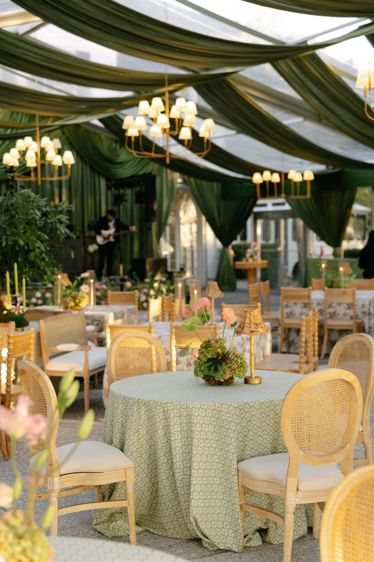
Rich color becomes more noticeable when it is surrounded by quieter surfaces. Neutrals therefore do more than fill the background. They determine how much visual weight a jewel tone carries and whether the overall room feels balanced.
The strongest neutral is not always white. The architecture, lighting, and lead color should guide whether the palette needs brightness, warmth, or sharper contrast.
Use Ivory and Cream to Lighten the Composition
Ivory and cream can keep saturated palettes from becoming visually dense, especially in dining environments where the same colors repeat across dozens of tables.
If burgundy appears through napkins or glassware, an ivory linen can provide a lighter foundation. If emerald upholstery becomes a focal point in a lounge, cream seating or table surfaces nearby can prevent the green from dominating the entire setting.
These lighter neutrals are especially useful when the venue itself has darker flooring, woodwork, or architectural finishes.
Introduce Warm Stone, Taupe, or Champagne for Softer Contrast
A palette does not always need the brightness of ivory. Warm stone, taupe, and champagne provide quieter contrast while retaining the depth expected at a fall gala. These tones can work particularly well with burgundy, plum, or emerald when the design needs warmth without becoming overtly seasonal.
Their subtlety also gives materials more room to matter. A textured taupe linen, for example, can create visual interest without introducing another competing color.
Use Charcoal or Black for Definition
Dark neutrals can sharpen a jewel-tone palette when applied selectively. Black chair frames, charcoal furniture, dark bars, or structured tabletop details can give burgundy, emerald, or sapphire clearer boundaries. The effect is often strongest when the darker elements appear as accents rather than broad surfaces.
Too much black combined with saturated colors can make an evening environment feel visually heavy, so lighter areas should remain within the composition.
Avoid Filling Every Surface With Color
One of the simplest ways to preserve sophistication is to leave some areas intentionally quiet.
A jewel-tone linen does not require matching chairs, napkins, glassware, florals, and lounge furniture. If the color already occupies a large surface, smaller pieces can shift toward neutral materials or related tones.
This restraint creates hierarchy. Guests can understand where the color is meant to lead rather than encountering the same visual intensity everywhere.
Decide Where the Jewel Tone Should Appear
The same color can create very different effects depending on where it is used. A full tablecloth carries substantially more visual weight than a napkin, glass, or accent chair.
For planners, deciding where the color belongs is often more important than simply choosing the shade.
Use Linens When the Color Should Shape the Entire Room
Table linens cover large repeated surfaces, which means a jewel-tone linen can quickly establish the dominant color across a ballroom.
This approach works best when the rest of the table is edited carefully. If burgundy or emerald already covers every dining table, the china, glassware, flatware, and florals can become comparatively restrained.
A strong linen gives the room a clear foundation, but it also uses much of the available visual intensity.
Use Napkins for a More Controlled Accent
Napkins provide a smaller repeated color moment and can be particularly effective when planners want to preserve a lighter room.
A burgundy napkin against an ivory linen, for example, introduces depth without turning the entire dining environment dark. Emerald, plum, or sapphire can work similarly when paired with a quieter tablecloth and controlled tabletop.
Because napkins repeat at every setting, even a small color application can still have substantial room-wide impact.
Introduce Color Through Upholstery
Jewel-tone upholstery can create a strong focal point in lounge or hospitality areas.
A single emerald sofa, pair of plum lounge chairs, or burgundy seating group can carry enough color to define the space. Nearby tables and supporting furniture can then remain more restrained.
This approach is particularly useful when the dining room already has its own color direction and planners want the lounge to feel connected without repeating the same treatment.
Use Glassware for Smaller Repeated Color Moments
Colored glassware introduces jewel tones in a more delicate way. Because each piece occupies relatively little visual area, tinted glass can be repeated across a dining room without becoming as dominant as a saturated linen. It also responds to surrounding light, creating another layer of depth as the event moves into the evening.
This makes glassware a useful choice when planners want color to remain visible but not overwhelming.
Treat Gold as a Finish, Not Another Large Color Field
Gold frequently accompanies jewel tones, particularly at formal fall galas. The combination can be beautiful, but it can also feel overly traditional when both the color and metallic finish are used heavily.
A more restrained approach allows gold to appear as a finish that catches light and defines smaller details rather than becoming another large visual surface.
Introduce Gold Through Smaller Details
Flatware, charger edges, candleholders, furniture frames, occasional tables, and selected bar details can introduce metallic warmth without dominating the room.
These smaller applications are often enough to connect a jewel-tone palette with a formal evening setting.
When gold appears in several categories, repeating the same intensity everywhere is unnecessary. One stronger metallic moment can be supported by subtler details elsewhere.
Choose Warm Metallics Based on the Lead Color
Different jewel tones respond differently to metallic finishes. Burgundy may pair comfortably with aged gold or brass, while emerald can work with both warm metallics and more understated finishes. Sapphire may benefit from warmer gold details when the overall palette needs greater balance.
Rather than following a rigid pairing rule, planners should consider the undertones of the actual fabrics, furniture, and tabletop pieces being used.
Balance Reflective Finishes With Matte Surfaces
Metallics become especially noticeable under evening lighting. If the event already includes reflective flatware, chargers, glassware, and decorative details, matte textiles or upholstery can provide necessary contrast. This balance gives the room depth while preventing every surface from competing for the same light.
Build Depth Through Texture Instead of Adding Another Color
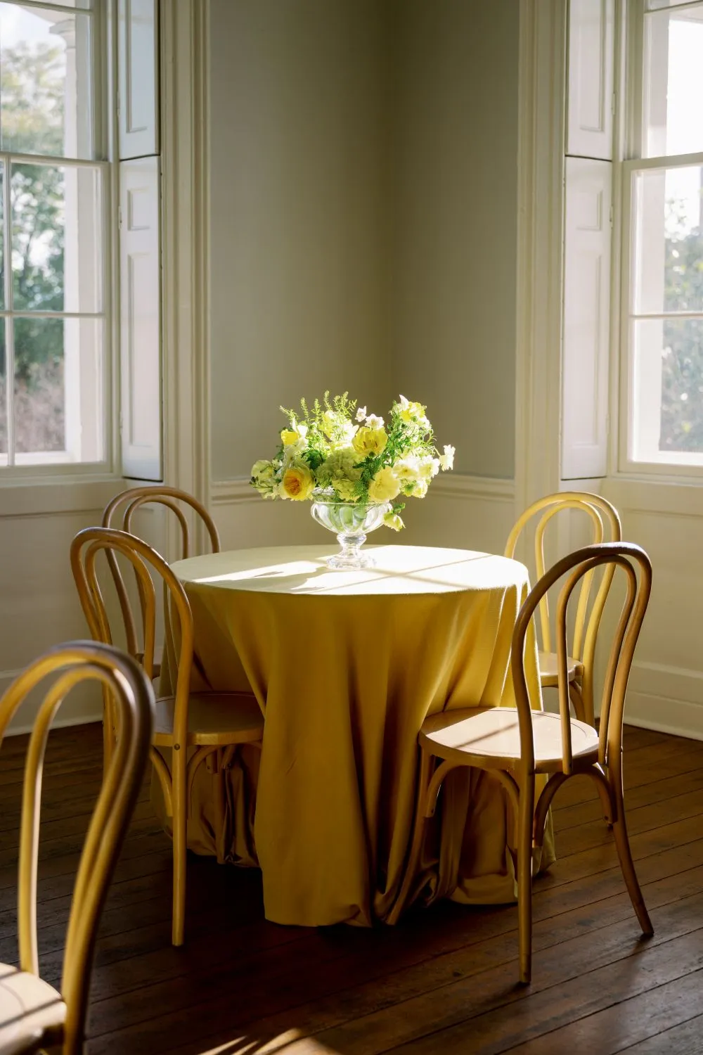
Once a jewel-tone palette has enough color, texture can provide additional richness without introducing another shade.
This is particularly valuable for formal fall events, where a narrow palette can still feel layered when fabrics, furniture, and tabletop materials respond differently to light. Read more in Fall Ceremony Arch and Backdrop Rentals in Charleston.
Combine Matte and Subtly Reflective Surfaces
A matte burgundy textile and a fabric with gentle sheen may appear close in color but create completely different visual effects.
Using both types of surfaces can introduce variation without disrupting the palette. A matte linen may provide the foundation, while a subtly reflective napkin or nearby upholstery adds another level of depth.
The same principle applies to emerald, sapphire, and plum.
Pair Soft Textiles With Structured Materials
Fabric-rich environments often benefit from harder surfaces nearby. Glass, polished metal, wood, stone-inspired finishes, or structured furniture frames can give the room greater definition. These materials prevent a jewel-tone palette from becoming overly soft or visually dense.
The contrast between upholstered furniture and a clean coffee table, or between rich linens and clear glassware, can be more effective than introducing another accent color. You may also find The Wedding Decoration Rental Guide helpful.
Use Pattern Sparingly
Pattern can work beautifully with jewel tones, but it requires enough surrounding restraint to remain clear. Read more in Say ‘I Do’ in Style: Luxury Elopement Rentals in Charleston.
A patterned linen that already includes several saturated colors should not automatically be paired with equally detailed china, glassware, or upholstery. One patterned surface can provide more impact when the surrounding pieces become quieter.
Scale matters as well. A pattern that reads strongly across the room may require more restraint nearby than one that becomes noticeable only at table level.
Let Texture Carry Some of the Seasonal Character
Fall does not need to be communicated only through color. Woven surfaces, rich upholstery, dimensional fabrics, warm woods, and layered materials can give the room seasonal depth even when the palette stays narrow. For more detail, see our article Essential Fall Wedding Rentals for Southern Charm and Style.
This is often what keeps jewel tones feeling sophisticated rather than thematic.
Adapt Jewel Tones to D.C. Gala Venues
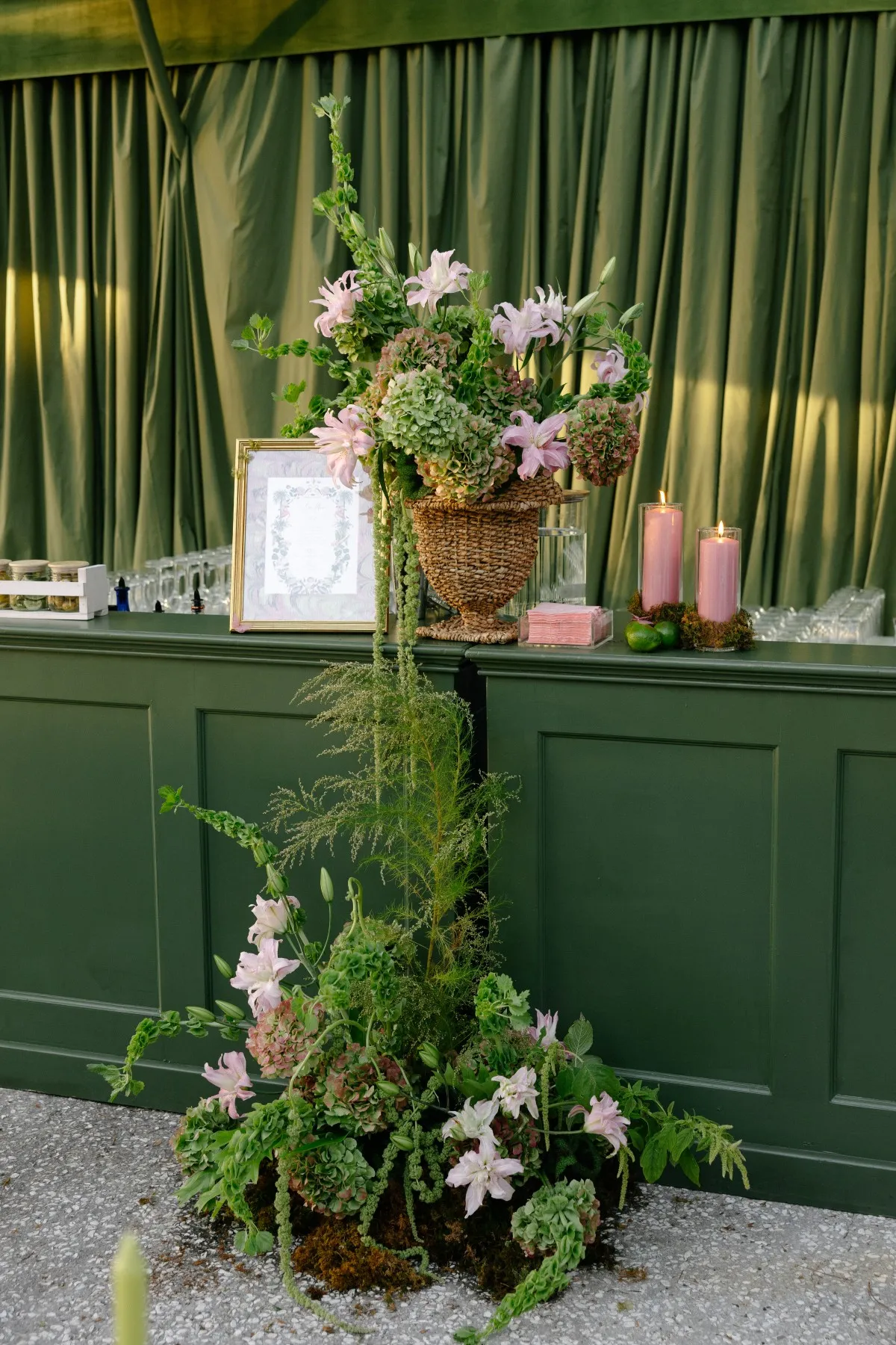
Washington, D.C. gala venues can vary dramatically in architecture and visual character. Historic interiors, modern museums, formal hotels, institutional settings, and tented environments each provide a different backdrop for saturated color. Read more in Discover Festive Winter Gala Décor Ideas for Your Next Event.
The venue should therefore be considered before the final palette is established.
Use Less Color in Highly Detailed Interiors
Architecturally rich spaces often need less from the rental palette. Ornate walls, dramatic flooring, chandeliers, decorative ceilings, or existing color can already contribute considerable visual information. In these environments, one jewel tone used selectively may create a stronger result than several competing shades.
A burgundy napkin, emerald chair, or sapphire glass may be enough to establish the direction while allowing the venue to remain part of the composition.
Let Contemporary Spaces Support Bolder Color
Minimal interiors often offer more freedom. A strong jewel-tone linen, upholstered sofa, or distinctive bar can introduce warmth and depth where the surrounding architecture is comparatively restrained.
Because cleaner spaces provide more visual room, saturated color can occupy a larger surface without competing with permanent details.
Respond to Existing Venue Colors
Carpets, walls, flooring, drapery, and built-in finishes should all be considered when evaluating a palette.
A burgundy that appears balanced against a neutral sample board may behave differently beside a patterned ballroom carpet. Emerald may either complement or compete with existing wood or wall tones.
Reviewing color in relation to the actual venue helps prevent unexpected clashes on event day.
Keep Tented Gala Palettes More Deliberate
A tent provides planners with a comparatively neutral environment, which increases control but also makes every rental choice more visible.
When there are fewer permanent architectural cues, repeated linens, furniture, flooring, and lighting establish most of the visual identity. A jewel tone can therefore become dominant very quickly if it appears across several large surfaces. Careful proportion becomes especially important.
Distribute Rich Color Differently Across the Gala
A gala does not need the same amount of color in every space. Varying the intensity across arrival, cocktails, dining, and lounge areas can give guests a sense of progression while maintaining one recognizable palette.
Introduce the Palette Lightly at Arrival
The arrival experience can hint at the main color direction without revealing it completely.
A jewel-tone accent chair, selected floral detail, or smaller textile moment can establish the palette while leaving the strongest expression for the primary gala environment. This keeps the event from feeling visually uniform from beginning to end.
Give the Dining Room the Strongest Color Structure
Dining rooms naturally support repetition, making them an effective place to establish the lead tone clearly.
The jewel color might appear through linens, napkins, glassware, or another repeated element depending on how saturated the overall room should become.
Because dozens of tables amplify even small details, planners do not need to use color everywhere to create a strong effect.
Use Lounge Areas for Deeper Upholstery
Cocktail or hospitality lounges provide an opportunity to work with saturated upholstery. A jewel-tone sofa or group of accent chairs can introduce greater richness than might be appropriate across every dining table. These furniture moments can also provide a different expression of the same palette.
Allow Secondary Spaces to Recede
Transition areas do not require the same color intensity as major program spaces.
Keeping corridors, secondary seating areas, or peripheral zones comparatively quiet allows the primary dining and hospitality environments to feel more significant. Luxury design benefits from this variation in visual emphasis.
Consider How Jewel Tones Change After Dark
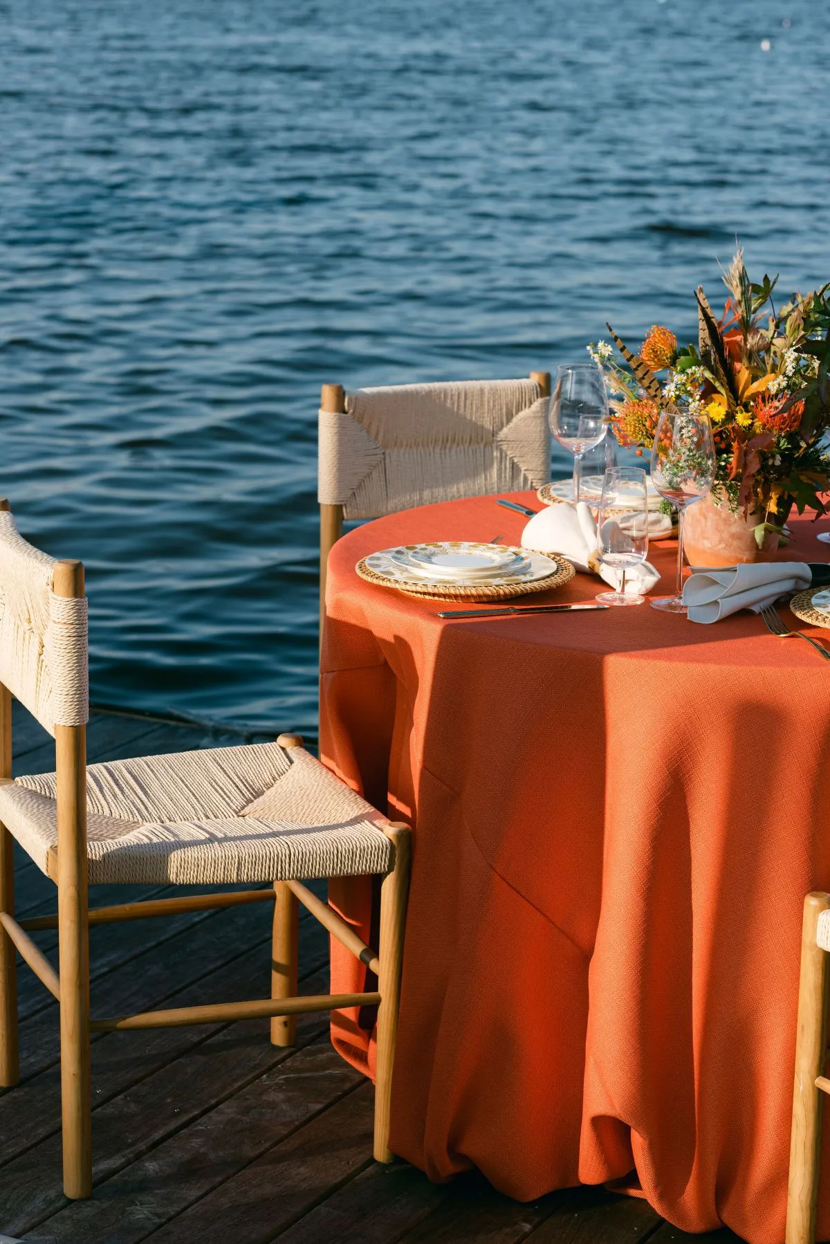
Deep colors should always be evaluated with evening conditions in mind. Burgundy, emerald, sapphire, and plum can look substantially different once natural light disappears and chandeliers, candles, or other event lighting become more influential.
Expect Dark Colors to Become Visually Heavier
Saturated fabrics often deepen under lower light. A burgundy linen that feels rich but balanced during the afternoon may appear considerably darker in the evening. Pairing it with ivory china, clear glass, lighter chairs, or other brighter surfaces can help preserve definition after sunset. The same consideration applies to deep green, blue, and purple.
Use Light to Reveal Texture
Evening illumination can make texture more apparent. Woven fabrics, subtle sheen, upholstered furniture, and faceted glass may gain dimension once they begin responding to artificial light. This allows a narrow palette to feel more layered without additional color.
Watch Reflective Gold and Metallic Details
Metallic finishes can become much more prominent after dark. Gold flatware, chargers, candleholders, and furniture details may all catch the same surrounding light. When several reflective surfaces are already present, adding another can make the room visually busy. The evening view should guide how much metallic detail is ultimately necessary.
Keep Some Surfaces Quiet Under Evening Light
Matte finishes become especially valuable in a richly colored evening environment. They provide visual relief between reflective glass, metallic accents, chandeliers, candles, and other illuminated surfaces. Not every piece needs to catch light in order to contribute to the design.
Keep Jewel Tones From Feeling Too Traditional
Classic fall combinations can feel current when color is paired with cleaner silhouettes, unexpected proportions, and a more edited material palette.
The objective is not to avoid familiar colors such as burgundy and gold, but to use them in a way that feels intentional rather than predictable.
Pair Classic Color With Cleaner Furniture
A rich burgundy linen can take on a more contemporary character when paired with streamlined chairs or restrained tabletop pieces. Likewise, emerald upholstery may feel more current beside clean occasional tables and structured furniture than when surrounded by heavily decorative pieces.
Contrast between traditional color and contemporary form can make both elements more interesting.
Replace Exact Matching With Tonal Relationships
A polished palette does not require the exact same burgundy or emerald to appear everywhere. Closely related tones often create more depth. A deeper sofa can sit comfortably beside a softer napkin shade, while a slightly different glass tone adds another layer without appearing mismatched. This makes the room feel collected and considered rather than overly coordinated.
Use One Unexpected Counterpoint
A cooler glass color, sharper furniture silhouette, pale neutral, or more contemporary metallic finish can shift an otherwise traditional palette.
The counterpoint should remain controlled. One unexpected detail is often enough to give a familiar color combination a fresher direction.
Edit Decorative Layers
When rich color already provides substantial visual presence, additional seasonal decoration may be unnecessary.
The palette itself can communicate fall through depth, warmth, and texture. Removing extra decorative layers often gives the strongest materials and colors more room to be appreciated.
Refine the Jewel-Tone Palette With Curated Events
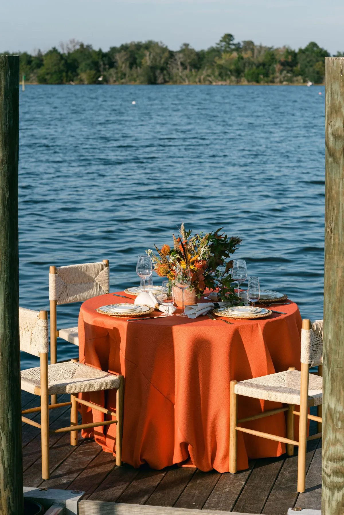
Once the primary color direction is established, the next step is to see how it translates across actual rental selections.
Rather than choosing linens, furniture, tabletop pieces, bars, and lighting independently, planners can evaluate the largest visual surfaces first and build smaller details around them.
Start With the Largest Color Fields
Determine where the lead jewel tone will have the greatest presence.
If it appears across dining linens, the room already contains a significant amount of saturated color. If it is concentrated in lounge upholstery or a statement bar, the dining environment may be able to remain comparatively light. Understanding these large color fields prevents the palette from becoming overdeveloped later.
Add Smaller Color Moments Second
Once the major surfaces are established, smaller pieces can reinforce the direction.
Napkins, glassware, chargers, occasional tables, and selected accessories can echo the lead tone without competing with it. This order of selection also makes it easier to see when the room already has enough color. See the full collection of Washington, DC décor rentals at Curated Events.
Compare Materials and Finishes Together
A successful jewel-tone palette depends on more than the relationship between colors.
Matte linens, reflective metals, clear or tinted glass, upholstered furniture, wood finishes, and patterned surfaces should be considered together. Seeing those material relationships can reveal whether another color is actually necessary. Often, greater material variation creates all the depth the event needs.
Remove Anything That Competes With the Lead Color
The final stage should involve editing. A second jewel tone may need to be reduced. A metallic detail might be unnecessary. A patterned linen may work better as a solid once the tabletop is assembled.
A refined gala palette gives each material and color a clear role rather than asking every selection to become a focal point.
Frequently Asked Questions
Which jewel tones work well for a fall gala?
Burgundy, emerald, sapphire, plum, and aubergine can all work beautifully for fall. Choose one as the dominant color and build the rest of the palette around it rather than using several equally strong shades.
Can burgundy and emerald be used together?
Yes, but one should usually carry more visual weight than the other. For example, burgundy might lead through linens while emerald appears as a smaller accent through upholstery or glassware.
How do you keep burgundy and gold from looking too traditional?
Use gold primarily through smaller finishes and pair burgundy with cleaner furniture silhouettes, restrained tabletop pieces, and lighter neutrals. Avoid repeating both colors across every element.
Should jewel tones be used on linens or smaller accents?
Either can work. A jewel-tone linen creates a much stronger room-wide effect, while napkins, glassware, or upholstery allow planners to introduce the same color more selectively.
What neutral colors work best with jewel tones?
Ivory, cream, champagne, warm stone, taupe, charcoal, and black can all work depending on the lead color and venue. The neutral should provide enough contrast without introducing another competing direction.
Can sapphire blue work for a fall gala?
Yes. Sapphire offers a cooler alternative to traditional fall palettes and can be balanced with warm metallic details, ivory, champagne, or candlelight.
Conclusion
Jewel tones create the strongest fall gala settings when they are used with control. One lead color, enough neutral space, carefully placed metallic details, layered texture, and thoughtful distribution across the room can create far more impact than combining every rich seasonal shade at once.
The venue also matters. A detailed historic interior may need only a restrained jewel-tone accent, while a contemporary ballroom or tented setting can support a stronger field of color. Lighting, existing finishes, furniture scale, and the transition from daytime to evening should all influence how much saturation the room can comfortably carry.
For D.C. fall galas, Curated Events can help planners compare linens, furniture, tabletop pieces, bars, lighting, and supporting rentals as part of one cohesive palette, allowing rich color to feel deliberate, layered, and appropriately refined. Ready to plan? Request a quote from Curated Events Washington, DC.