
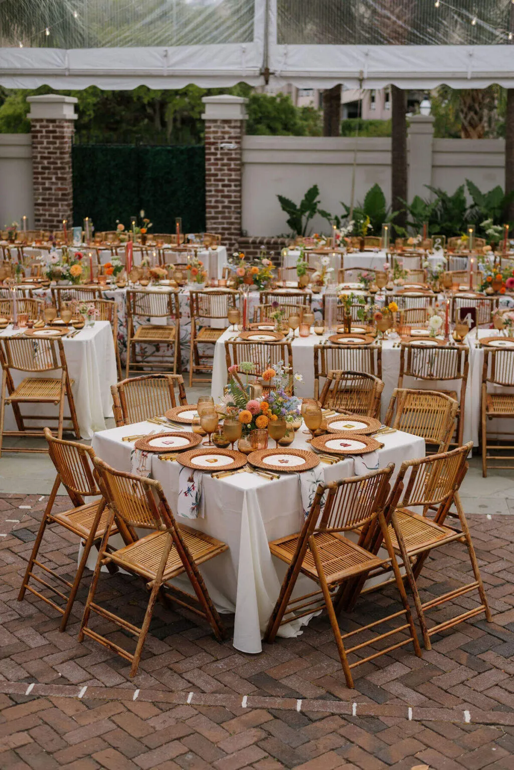
A reception tablescape is one of the few elements of an event that guests experience at close range for an extended period, which makes every material, finish, and proportion more noticeable. The linen beneath each place setting, the shape of the glassware, the weight of the dinnerware, and the relationship between color and texture all contribute to the atmosphere once guests take their seats. For a fall celebration in Nashville, that seasonal character does not need to come from literal autumn décor. Richer materials, thoughtful contrast, deeper tones, and warm evening light can establish a sense of season in a way that feels more refined and enduring.
The strongest tablescapes are rarely built around one standout piece. Instead, tables, linens, dinnerware, glassware, flatware, chairs, florals, and lighting work together as part of one composition. Curated Events Nashville offers these elements across its rental collections, allowing planners and couples to approach the table as an extension of the complete reception environment rather than as an isolated design moment.
Where Should a Fall Tablescape Begin?
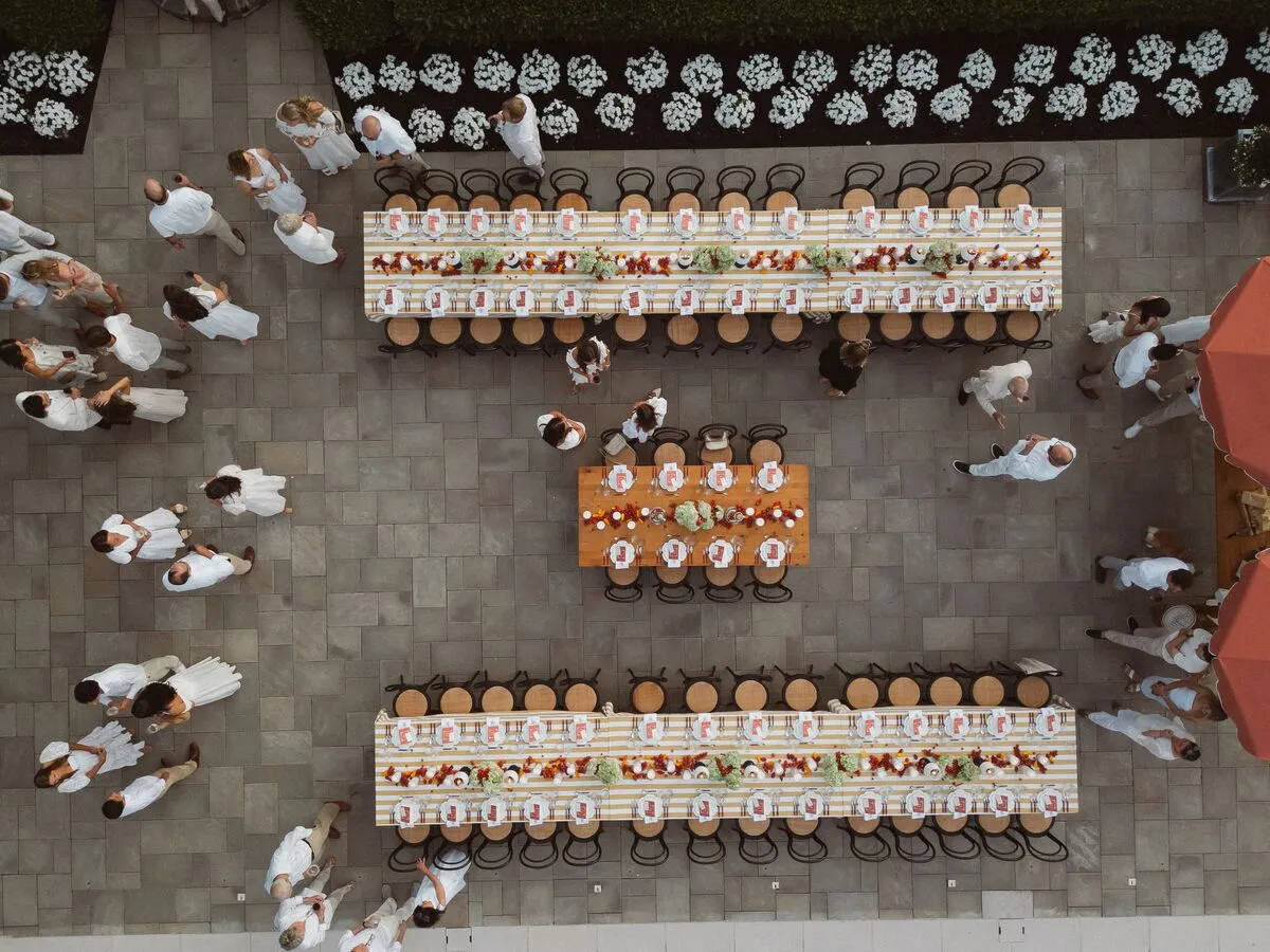
A successful tablescape begins before the linen or dinnerware is selected. The venue, table configuration, lighting, and overall atmosphere establish the framework for every decision that follows, so starting with that broader context helps prevent the design from becoming a collection of individually attractive pieces that do not quite relate to one another.
Consider the Venue Before Selecting Tabletop Details
Every venue brings its own visual language. A historic interior may already have detailed millwork, patterned floors, strong architectural color, or decorative lighting, while a contemporary space may offer a quieter backdrop with cleaner lines and fewer competing details. A tented reception creates another set of considerations altogether, where the tablescape interacts closely with flooring, tent material, lighting, and the surrounding landscape.
The table does not need to match the venue literally, but it should respond to it. A richly detailed room may benefit from a more restrained tabletop, while a simpler space may allow stronger linen, glassware, or dinnerware choices to take greater visual prominence. Existing wall tones, flooring, natural light, ceiling height, and evening lighting can all influence how color and material are perceived once the reception begins.
Confirm the Table Shape and Scale Early
Table shape changes the rhythm of a reception and the way the tabletop is experienced across the room. Round tables create individual groupings, while long rectangular or banquet tables establish stronger visual lines and often lend themselves to more continuous floral, linen, or candle arrangements. Mixed configurations can introduce variety and help define different parts of a larger reception, particularly when the event includes multiple dining zones.
The table itself also determines how much room is available for each place setting. A narrow banquet table requires tighter editing, while a larger round table may support more generous spacing between glassware, flatware, florals, and menus. Confirming the table configuration before building the tablescape makes it easier to choose proportions that work in the actual reception rather than only in a sample setup.
How Can Linens Establish the Foundation of a Fall Table?
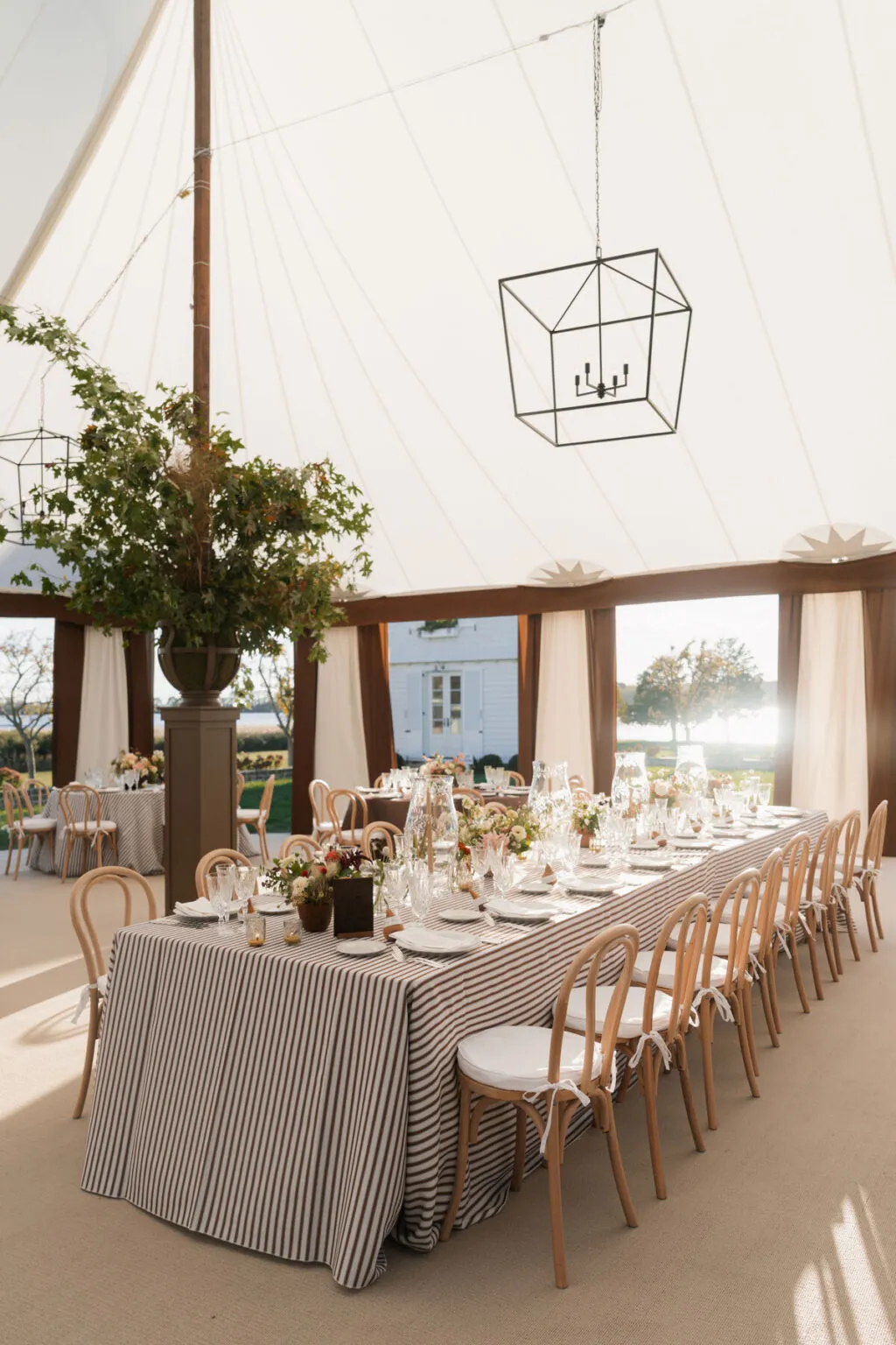
Linens cover more visual area than almost any other tabletop element, so they naturally establish much of the table’s color, softness, and texture. They can create a quiet foundation for expressive dinnerware and florals or become one of the leading design elements themselves through pattern, tone, or material.
Start With the Largest Surface
The base linen creates the backdrop against which every place setting will be viewed. A neutral cloth in ivory, taupe, stone, or another softened tone can provide room for colored glassware, deeper napkins, or patterned plates to stand out. A richer linen can create a stronger mood on its own, particularly when the remainder of the table is kept more restrained.
Fall does not require dark fabric. Lighter linens can still feel appropriate to the season when paired with warm materials, layered glassware, or deeper accents elsewhere on the table. The choice should come back to the overall reception palette and the role the table needs to play within the room.
Add Texture With Purpose
Texture is most effective when it contributes something the table would otherwise be missing. A subtle woven surface can give dimension to simple dinnerware, while a runner can introduce definition along a long table without covering the entire surface. Napkins can provide another textural shift, especially when their fabric contrasts gently with the base linen.
Additional layers should not be added simply to make the table feel fuller. A single textured linen may be enough if the dinnerware and glassware already carry visual interest, while a quieter tabletop may benefit from a runner, overlay, or contrasting napkin. Each layer should have a distinct role within the composition.
Use Napkins as a Controlled Color Accent
Napkins offer one of the easiest ways to introduce a smaller color moment without changing the entire foundation of the table. A neutral base linen might be paired with burgundy, olive, plum, tobacco, or muted blue, while a more saturated table covering may work better with a quieter napkin that allows the larger surface to remain dominant.
Placement also changes the visual effect. A napkin laid across a plate creates a stronger color block than one folded beside the flatware, and a softer draped placement will read differently from a crisp, structured fold. These details are small, but because they repeat at every place setting, they have a noticeable impact across the room.
Consider How Lighting Will Change the Linen
A linen selected in daylight may look considerably different after sunset. Warm evening lighting can soften cooler neutrals, deepen saturated tones, and make woven surfaces more visible, while candlelight may bring additional warmth to metallic or glass elements nearby. For fall receptions that begin in the afternoon and continue well into the evening, it is worth considering how the table will transition through both conditions.
Rather than selecting linen in isolation, planners can evaluate it alongside the intended lighting direction. The strongest choice should continue to support the room as the light changes, not only during the earliest part of the event.
How Can Dinnerware Add Texture and Contrast?
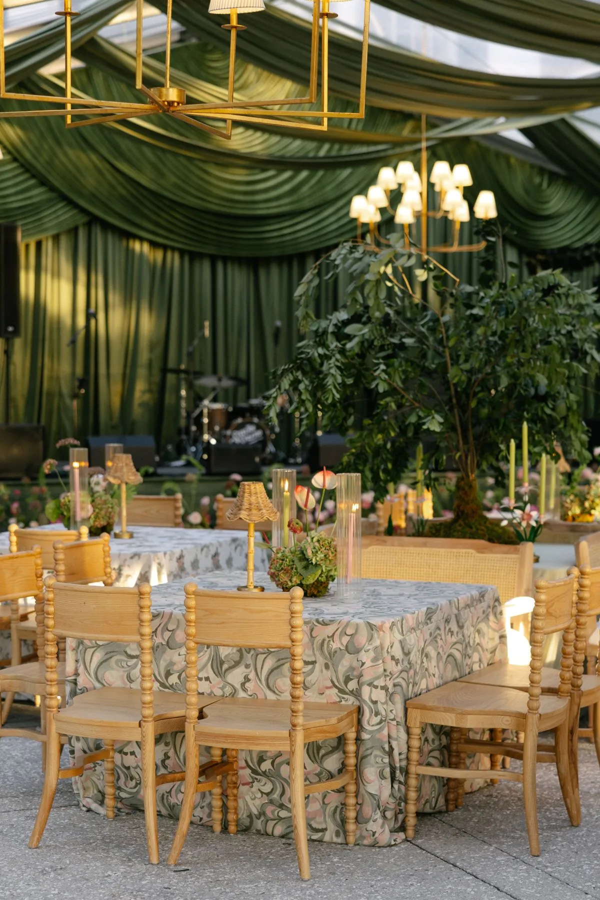
Dinnerware occupies a smaller area than the linen, but it sits at the center of every place setting and therefore carries considerable visual weight. Its pattern, color, rim, texture, and shape can either support the broader design quietly or become one of the most distinctive details on the table.
Decide Whether Dinnerware Should Lead or Support
Not every design element should compete for attention. If a table already includes patterned linen, expressive florals, or strongly colored glassware, quieter dinnerware may provide the balance the setting needs. A restrained plate allows the surrounding materials to remain visible without making the place setting feel empty.
When the foundation is simpler, dinnerware can take a more prominent role. Patterned china, textured surfaces, decorative rims, or deeper colors can introduce detail directly at guest level. Establishing whether the plates are meant to lead or support the composition helps prevent the table from becoming visually crowded.
Mix Pattern and Texture Carefully
Pattern and texture can coexist successfully when one is given greater visual priority. A patterned plate may work beautifully over a solid linen, while a textured dinnerware set can add depth against a smoother fabric. When both the textile and plate carry strong pattern, scale becomes especially important; smaller motifs may sit comfortably against a larger design, while two similarly dominant patterns can quickly compete.
Texture often provides a quieter form of contrast. A matte or subtly dimensional plate can sit beside polished glassware, while a smooth china surface may provide relief against a more tactile linen. The strongest combinations tend to include both repetition and contrast rather than relying exclusively on one surface quality.
Layer Only When the Composition Needs It
Dinner plates, salad plates, chargers, and other tabletop pieces can create depth when they serve a clear purpose, but the setting does not need to be layered simply for the sake of appearing elaborate. Each additional piece should either support the meal or contribute meaningfully to the overall visual direction.
A restrained place setting can feel more sophisticated than a heavily layered one when the proportions are right. The table should still leave space for glassware, flatware, menus, candles, florals, and service, so the full composition matters more than the number of elements stacked at each seat.
How Do Flatware and Glassware Add Dimension?
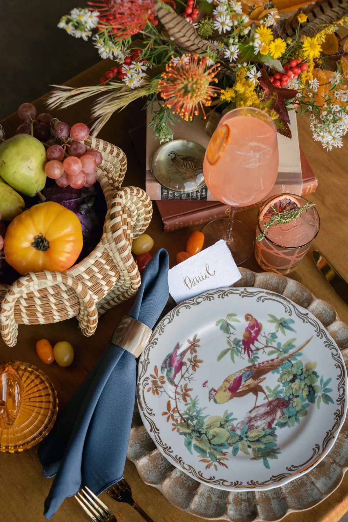
Flatware and glassware introduce some of the smallest details on the table, but repeated across dozens of settings, they can change the overall character of the reception significantly. Their finish, color, transparency, and silhouette are particularly useful for creating contrast without introducing another large surface.
Use Flatware Finish to Refine the Palette
Classic silver can support a traditional or understated table, while matte black introduces stronger graphic contrast. Gold and other warmer metallic finishes can add warmth, especially when paired with deeper tones or softened neutrals, but the finish should respond to the rest of the setting rather than being selected simply because it feels seasonal.
If metallic detail already appears elsewhere in the design, flatware can be quieter. Conversely, when the linen and dinnerware are restrained, a more distinctive flatware finish may provide just enough definition. The goal is to create a considered relationship between the pieces rather than treating each as a standalone accent.
Let Glassware Introduce Color or Shape
Glassware offers a particularly elegant way to introduce color because its transparency keeps the effect lighter than an opaque element. Amber, green, blush, or other colored glass can bring depth to a neutral setting, while clear glass can still make an impact through fluted, ribbed, or sculptural shapes.
The repetition matters as much as the individual glass. One colored goblet may appear subtle in a showroom, but when repeated across a full table or throughout an entire reception, the color becomes a much more significant part of the design. Looking at the effect at scale helps determine whether the glassware should lead or simply support the overall palette.
Balance Decorative Elements Across the Place Setting
A table can quickly become overly complicated when the linen, dinnerware, flatware, and glassware all carry strong color or texture. Balance gives each element space to register. Expressive glassware may pair best with quieter plates, while patterned dinnerware may benefit from clear glass and more restrained flatware.
Editing is as important as selection. The strongest tablescapes often feel layered because different materials are present, but not every material is asking for equal attention.
How Can a Fall Palette Feel Seasonal Without Becoming Literal?
Seasonal design works best when the atmosphere suggests fall rather than simply illustrating it. Color, light, material, and texture can all create a sense of autumn without relying on obvious motifs or a narrowly defined palette.
Begin With Tone Rather Than Theme
A fall palette might draw from warm ivory, taupe, cognac, burgundy, plum, olive, forest green, amber, deep blue, chocolate, black, or muted metallics, but those colors do not need to appear together. A nearly neutral table can still feel distinctly seasonal through richer textiles and warm evening light, while a more saturated palette can remain modern when the deeper tones are used selectively.
Starting with mood rather than a list of prescribed fall colors creates more flexibility. A refined reception may use only one deeper accent against warm neutrals, while another may combine several saturated shades in a more layered way.
Use Contrast to Create Depth
Contrast can come from color, but it can also come from material. A pale linen paired with dark flatware creates one type of definition, while matte dinnerware beside polished glass creates another. Transparent glass against opaque ceramics, soft textile against structured metal, and warm wood against cooler tabletop finishes all help the composition feel more dimensional.
These relationships often communicate season more effectively than a literal autumn color scheme because they create warmth and depth through material rather than theme.
Avoid Relying on Traditional Autumn Motifs
A rich textile, amber glass, warm metallic detail, deeper floral palette, or softly illuminated table can suggest fall without pumpkins, scattered leaves, or harvest imagery. This approach gives the design greater longevity and allows the architecture, venue, and broader wedding aesthetic to remain visible.
The season should influence the atmosphere rather than dictate every decorative choice.
How Should the Tablescape Respond to the Venue?
A tablescape does not exist in isolation. It sits within a ballroom, tent, garden, estate, or contemporary event space, and the relationship between the table and its surroundings can make the difference between a design that feels integrated and one that feels imported.
Historic and Traditional Interiors
Traditional venues often contain considerable visual detail already, from ornate lighting to patterned floors or decorative millwork. In these spaces, the tablescape may benefit from restraint so that it complements rather than competes with the architecture. Rich fabrics, classic dinnerware, or warm metallic finishes can still be used, but they do not all need to appear together.
Sometimes the most effective relationship comes from responding to only one or two existing features. A wood tone in the room may reappear subtly in furniture, while a metallic detail from the architecture may be echoed through flatware or candleholders without creating a literal match.
Contemporary Venues
Contemporary spaces often allow material, shape, and negative space to carry more of the visual interest. Cleaner table lines, restrained palettes, and intentional contrast can work especially well in these environments because each element is easier to see against a simpler architectural background.
A contemporary fall tablescape might rely on a pale textured linen, dark flatware, clear or colored sculptural glassware, and one deeper accent tone rather than multiple layers. The result can still feel seasonal through warmth and materiality rather than decoration.
Tented Receptions
In a tented reception, the tables contribute substantially to defining the interior. Linens, chairs, tabletop, and lighting help transform an open structure into a complete dining environment, particularly as daylight fades and artificial lighting begins to shape the room.
The tabletop should also respond to the tent material, flooring, and landscape beyond the structure. A softer palette may allow the outdoor setting to remain visible, while deeper tones can help establish a more defined evening atmosphere once the reception moves fully indoors beneath the tent.
Outdoor and Estate Settings
Outdoor settings already provide texture, color, and movement through landscape, architecture, and changing light. The tablescape does not necessarily need to compete with those surroundings. In many cases, restraint allows gardens, trees, views, or historic property details to remain part of the experience.
Alternatively, a stronger color story can help define the dining area within a larger lawn or estate setting. The decision should come back to whether the table is meant to blend with the environment or create a more deliberate focal point within it.
How Do You Keep a Layered Tablescape From Feeling Overdone?
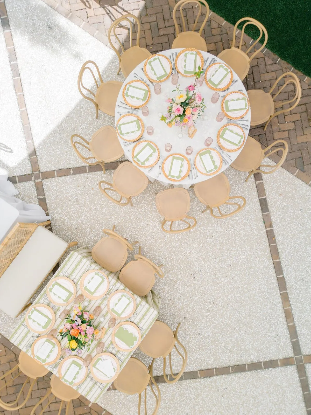
Layering works when there is hierarchy. Without it, linen, dinnerware, glassware, flatware, florals, candles, menus, and decorative details can all begin competing for the same attention, leaving the table visually crowded even when each individual piece is attractive.
Establish One or Two Leading Elements
Identifying the strongest visual elements early gives the rest of the table a clearer supporting role. Patterned linen may call for quieter dinnerware, while distinctive plates may work best over a restrained textile. Colored glassware can become the primary accent against an otherwise tonal table, and sculptural florals may require the place settings beneath them to stay comparatively simple.
This hierarchy gives the eye somewhere to rest and makes the overall design easier to understand.
Limit Competing Finishes
Variety creates depth, but too many unrelated finishes can make the table feel fragmented. Polished metal, matte black, colored glass, textured ceramic, patterned fabric, multiple wood tones, and high-impact florals may all work individually, but combining them without a clear hierarchy can overwhelm the composition.
Repeating selected materials or finishes creates continuity, while a limited number of contrasting elements keeps the table from feeling flat.
Protect Functional Space
The table still needs to be comfortable to dine at. Large centerpieces, multiple glasses, layered dinnerware, menus, candles, decorative objects, and place cards can quickly consume the available surface, particularly on narrower banquet tables.
A successful tablescape should feel generous rather than crowded. Practical space is not separate from good design; it is part of what makes the table feel composed.
Consider Florals Before Adding Another Layer
Florals can change the visual weight of the table dramatically. A place setting that appears restrained before the centerpiece is installed may feel perfectly balanced once flowers, greenery, and candles are added, while an already elaborate tabletop may become excessive when paired with a larger floral design.
Evaluating the tabletop and floral direction together makes it easier to know when the table needs another layer and when it needs editing instead.
How Do You Bring the Full Tablescape Together Before Finalizing Rentals?
Individual rental pieces can look very different once they are assembled into a complete table. Before finalizing selections, it helps to review the composition as a whole and consider how each material, finish, and proportion interacts with the others.
Review the Complete Table, Not Individual Pieces
Linen, dinnerware, flatware, glassware, chairs, florals, menus, candles, and lighting should ultimately be judged together. A plate that looks understated by itself may be exactly what a heavily textured linen needs, while a colored glass that appears subtle in isolation can become much more prominent once repeated across a full reception.
Looking at the complete composition gives a more accurate sense of balance than evaluating each rental separately.
Check Proportion and Scale
Scale becomes increasingly important once multiple elements are introduced. Large glassware may shift the balance of a delicate place setting, a substantial charger may leave less room than expected, and a generous floral arrangement may require the surrounding tabletop to remain quiet.
Reviewing those relationships before finalizing quantities helps prevent unnecessary adjustments later in the planning process.
Compare Materials and Finishes Together
Wood, metal, glass, textile, ceramic, and floral material each bring a different quality to the table. Some repetition creates continuity, while contrast keeps the composition visually interesting. The most successful combinations usually allow several materials to interact without assigning each one equal visual importance.
When helpful, planners and couples can review selections in person to compare color, scale, and texture more accurately. Curated Events maintains Nashville showroom locations where tables, linens, tabletop pieces, and other rentals can be viewed by appointment, making it easier to evaluate the complete design rather than relying on individual product images.
Frequently Asked Questions
Do fall tablescapes need traditional autumn colors?
No. Fall character can be introduced through texture, warm materials, deeper tones, lighting, and contrast rather than a traditional orange, red, or brown palette. Neutral, romantic, contemporary, and high-contrast color schemes can all feel appropriate for an autumn reception when the material choices support the season.
Should linens match the dinnerware?
Not exactly. Linens and dinnerware should work together, but contrast often creates a more interesting composition. Patterned or richly textured linen may pair well with quieter plates, while distinctive dinnerware can stand out more effectively against a restrained textile.
Can Curated Events Nashville coordinate tables, linens, and tabletop rentals?
Yes. Curated Events Nashville offers tables, linens, dinnerware, glassware, flatware, chairs, lighting, and other complementary event rentals. Considering these elements together can help the reception feel cohesive from the overall room down to each individual place setting.
Conclusion
Designing a fall tablescape is less about following a seasonal formula and more about understanding how the individual layers relate to one another. Table shape establishes the framework, linens introduce color and texture, dinnerware, glassware, and flatware add contrast at guest level, and florals and lighting shape how the composition is ultimately experienced within the room.
For a Nashville fall reception, the season can be expressed subtly through material richness, tonal depth, warm light, and the gradual transition from afternoon into evening rather than through literal autumn motifs. When tables, linens, tabletop pieces, chairs, and surrounding reception elements are considered as one complete composition, the result feels intentional at every scale, from the architecture of the room to the details directly in front of each guest.