
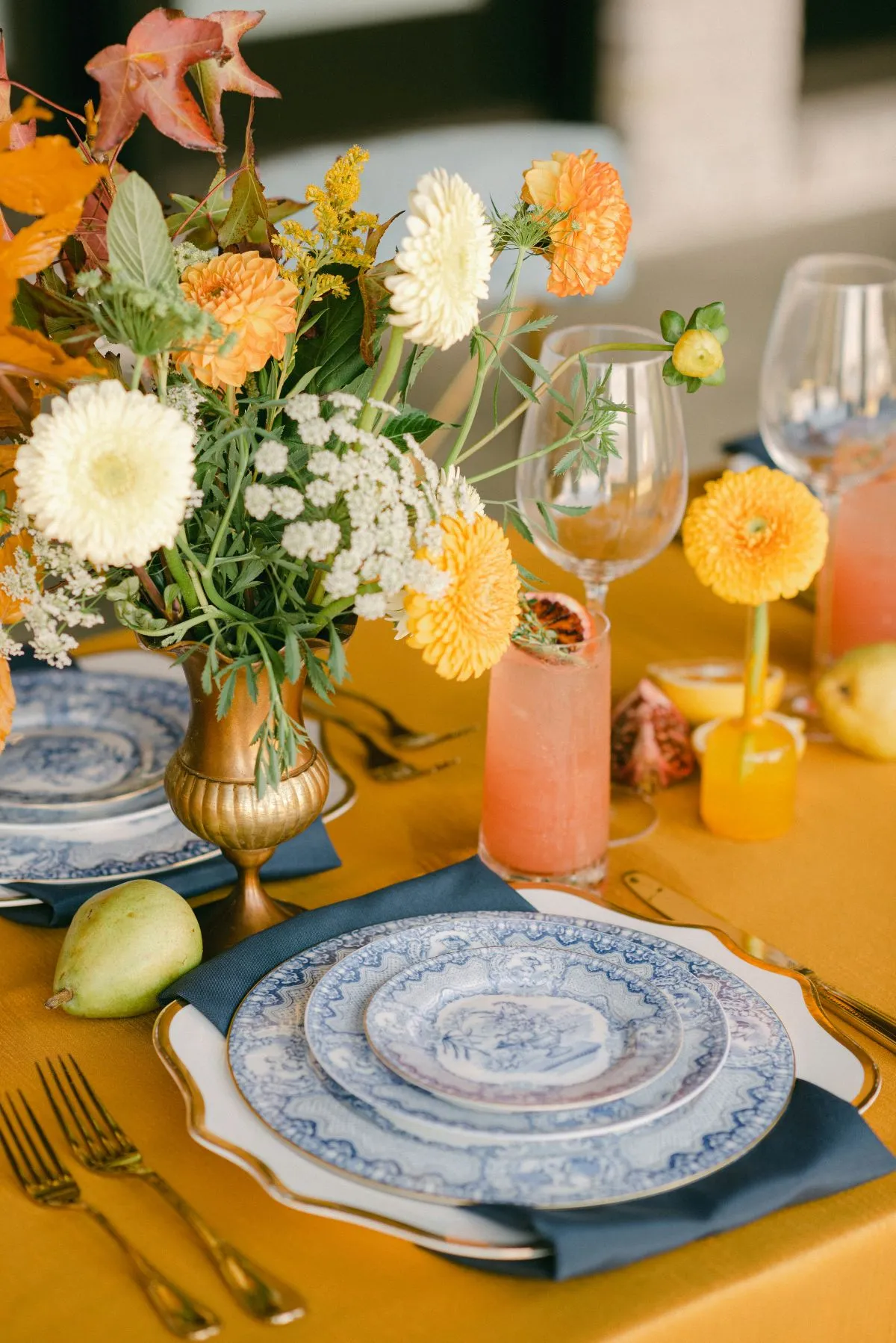
Charleston offers a distinctive starting point for autumn event design. Rather than the bright red and orange foliage associated with other regions, the Lowcountry brings together marsh grass, live oak greenery, historic brick, weathered stone, waterways, dark wood, and warm evening light. These surroundings can inspire a fall palette that feels connected to the location without relying on literal seasonal decorations.
Within the tablescape, linens create one of the largest visible fields of color. Their undertone, pattern, and visual weight affect how floral arrangements appear against them. A deep olive linen can make ivory and aubergine florals feel luminous, while an indigo pattern may call for a quieter floral palette with more visible space.
The most cohesive approach begins with the venue, establishes the linen as the color field, and then uses florals to create either harmony or intentional contrast. Supporting tabletop details should follow after that central relationship is clear.
Read the Charleston Setting Before Selecting a Color
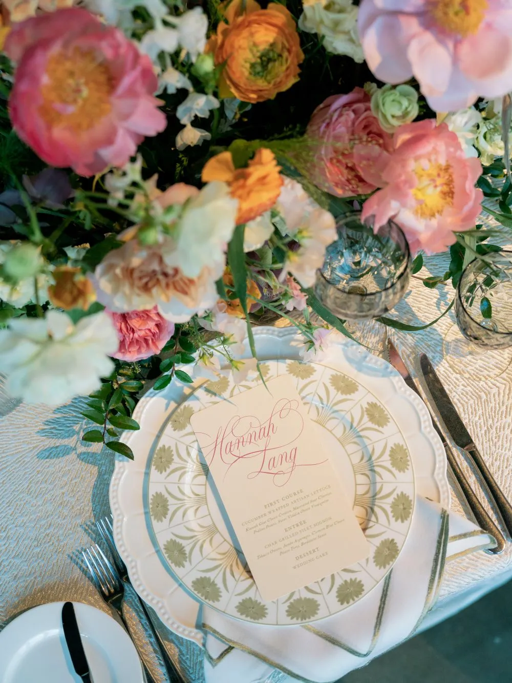
Every Charleston venue brings existing colors and materials into the event. Architecture, landscaping, water views, flooring, and natural light all become part of the palette, even when they are not included on a design board. Reading those elements first helps the linens and florals feel settled into the location.
Historic Homes and Brick Courtyards
Historic properties may feature brick, ironwork, stone, dark shutters, painted façades, and warm wood. These details already contribute considerable color and texture. A palette that competes with all of them can make the setting feel visually crowded.
Mushroom, dove, ivory, olive, muted ruby, and soft gold linens can complement these surroundings without trying to reproduce them exactly. Bright orange or highly saturated red may compete with historic brick, while quieter floral tones such as blush, cream, aubergine, muted berry, and tonal green can create greater separation.
Consider the architectural symmetry as well. A formal courtyard may benefit from a controlled palette with a repeated linen color, while a room with layered historic details may call for a quieter table foundation.
Oak-Lined Gardens and Estate Lawns
Charleston gardens often retain several shades of green through fall. Live oaks, lawns, hedges, and established plantings may remain the strongest colors in the setting. The event palette can work with that greenery rather than replacing it with conventional autumn orange.
Fern, olive, sage, ochre, mushroom, and warm ivory can all respond to a garden or estate setting. Florals can introduce muted berry, plum, tobacco, cream, or gently warm tones while allowing surrounding greenery to remain part of the composition.
When the venue already has a dense botanical background, avoid using every green tone in equal amounts. One green can lead, another can support, and a restrained warm or neutral color can provide relief.
Waterfront and Marsh Settings
Waterfront properties bring blue-grey water, pale sky, marsh green, straw-colored grasses, sand, and weathered wood into view. These colors can support an autumn design that feels distinctly coastal without becoming a summer palette.
Indigo, blue-grey, warm stone, sand, ochre, and ivory are useful linen directions. Copper, cream, muted coral, aubergine, and deep botanical green can then shape the floral palette. The result gains seasonal depth through warmth and contrast rather than through literal leaf colors.
The horizon and surrounding view also create visual openness. Strong patterned linens can work in this context, but floral scale should be controlled so the tables do not block or compete with the setting.
Tented and Indoor Events
A tent or neutral indoor room may not provide the same immediate palette as a garden or waterfront venue. The linen can therefore carry more of the color direction. Tent roofing, draping, flooring, chairs, and lighting still influence how that color will appear.
Clear roofing allows surrounding trees, sky, and evening reflections to remain visible. A white tent roof creates a more controlled field and can reflect interior lighting onto the linen. Indoors, wall color, carpet, woodwork, and existing fixtures should all be considered before the final selection.
Let the Linen Establish the Color Field
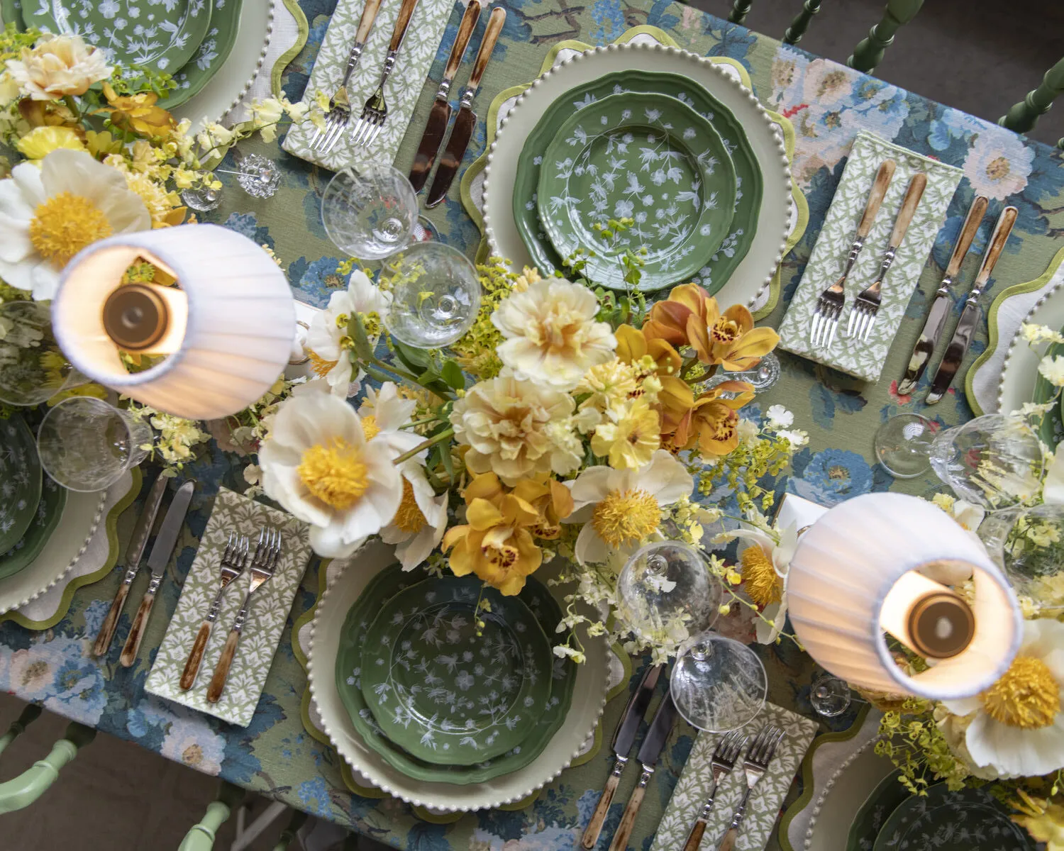
Florals may draw the eye first, but linens occupy more visual space across the room. Deciding whether the linen will provide a quiet foundation or become a statement helps define the role of the arrangement above it.
Use a Solid Linen When the Florals Will Lead
A solid linen gives an expressive arrangement a stable background. This approach works well when the florals include several colors, substantial scale, strong contrast, abundant foliage, or an asymmetrical form.
The linen does not need to match the dominant flower color. It can repeat a secondary tone, connect with the venue, or establish a compatible neutral. A mushroom linen, for example, can support blush and ruby florals without duplicating either color. Olive can form a botanical field beneath ivory and aubergine.
Think about the full room rather than one arrangement. Repeating a solid linen across several tables creates rhythm and allows floral variation to feel intentional.
Use Pattern When the Florals Will Be More Restrained
Patterned linens bring movement and detail before any flowers are placed. A botanical print, stripe, or repeated motif may serve as the table’s leading design element. The floral palette should then respond without reproducing every color in the pattern.
Tonal arrangements, one dominant flower color, restrained foliage, simple vessels, and visible negative space often work well above expressive linen. The arrangement can still have height or scale, but limiting the number of colors keeps the table from becoming visually fragmented.
Review how much of the pattern will remain visible once place settings, menus, glassware, and florals are added. If only small portions can be seen, make sure those areas still reveal the pattern clearly.
Read the Linen’s Undertone
Color names provide a useful starting point, but the undertone determines whether two elements feel connected. Yellow-toned ivory behaves differently from crisp white. Warm olive differs from blue-green sage, while brown-toned mushroom creates a different foundation from cool dove grey.
Ruby may lean toward warm red, while plum often contains more blue. Ochre can appear softly golden or comparatively bright depending on the surrounding colors and light.
Share the physical linen swatch with the floral designer whenever possible. Digital images can shift color, and a name alone may not reveal how the linen will respond to floral tones in person.
Consider the Linen’s Visual Weight
Dark solids, large botanical patterns, pronounced stripes, and dimensional surfaces carry more visual weight than pale solids or quiet motifs. They attract attention across the room and may require more restrained floral color or greater negative space.
A lighter linen can support a fuller arrangement or stronger contrast. A darker linen may still work with abundant florals, but the shapes and colors need enough separation to remain clear. Visual weight is not a reason to avoid depth. It is a reason to decide where that depth should appear.
Choose the Relationship Between Linen and Florals
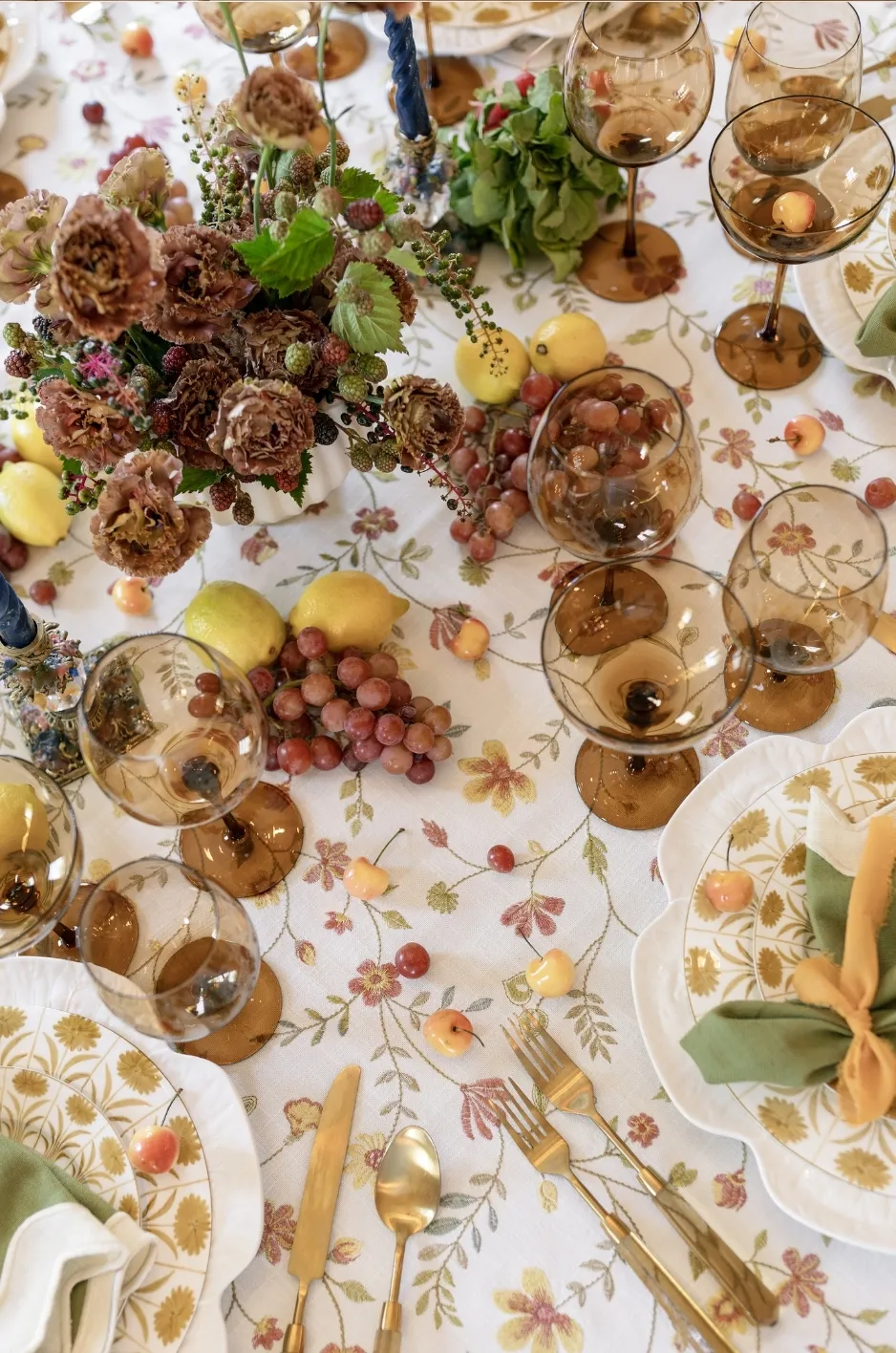
Linens and florals can relate in several ways. They may stay within one tonal family, create a controlled contrast, or use a quiet foundation beneath one floral statement. Choosing the relationship early prevents accidental matching and scattered accents.
Tonal Coordination
Tonal palettes use neighboring shades from the same color family. Olive linen may sit beneath fern, moss, and cream florals. Ruby linen can support burgundy, plum, and blush. Ochre can relate to amber, tobacco, and warm ivory, while indigo can pair with blue-grey, cream, and muted copper.
Tonal does not mean identical. Differences in lightness, depth, and saturation keep the table dimensional. If the linen, flowers, foliage, napkin, and glassware all share the same intensity, the composition may appear flat.
Use the lightest and darkest tones selectively. A pale floral color can lift a deep linen, while a dark botanical detail can give structure to a lighter one.
Controlled Contrast
Contrast creates separation between the linen and floral arrangement. The colors should stand apart while sharing compatible undertones or a connection to the venue.
Olive linen can support blush and aubergine florals. Mushroom can create a calm field for ruby and muted coral. Indigo works well with copper and warm ivory, while ochre can provide an expressive base for plum and deep botanical green.
One primary contrast is usually enough. Adding several unrelated accent colors may weaken the relationship and make supporting details difficult to coordinate.
A Quiet Field With One Floral Statement
Dove, ivory, mushroom, and other restrained linens can create a quiet field beneath a more expressive floral composition. This direction is especially useful when the venue already contains several visible materials or colors.
The arrangement may introduce scale, a strong color transition, or a distinctive vessel without competing against the linen. Supporting tabletop pieces should remain edited so the floral statement retains its role.
Build a Palette From the Charleston Linen Collection
The Curated Linen Collection includes colors and patterns that can support several Charleston fall directions. Product availability, dimensions, and quantities should always be confirmed, but named selections offer a more useful starting point than a generic list of orange, red, and brown.
Marsh Olive, Warm Ivory, and Aubergine
Emerson Olive or another locally available olive linen can establish a strong connection with gardens, estate lawns, and marsh landscapes. Pair it with ivory, aubergine, and tonal green florals. Antique-gold or dark-wood details can provide a supporting neutral.
Ivory keeps the palette from becoming too dark, while aubergine introduces autumn depth without relying on bright orange. The arrangement can be tonal and botanical or use aubergine in a smaller, more concentrated role.
This direction works especially well when the surrounding venue remains green. The linen feels connected to the landscape, while the deeper floral tone marks the seasonal shift.
Ochre, Tobacco, and Cream
Eloise Ochre or a related ochre linen can reflect the warmth of late-afternoon light, historic interiors, and aged architectural finishes. Pair it with cream, amber, tobacco, and restrained botanical green florals. Espresso or aged metal can add structure.
Because ochre already has a strong presence, the floral palette should remain controlled. Cream provides light, tobacco extends the warmth, and green keeps the arrangement connected to the Lowcountry landscape.
This palette can suit historic properties, tented dinners, and evening events where lighting deepens the linen after sunset.
Mushroom, Blush, and Ruby
Charlotte Mushroom creates a versatile warm-neutral field for blush, muted ruby, plum, and cream florals. Brass or warm-toned glass can bridge the lighter and deeper colors.
This direction works in formal courtyards, indoor rooms, and estate settings where brick, stone, or dark wood already contributes warmth. Mushroom allows the floral colors to stand out without producing a hard contrast.
Ruby should be used according to the floral scale. A large arrangement may need the color concentrated in selected areas, while a smaller composition can carry a greater proportion of the deeper tone.
Indigo, Copper, and Warm Ivory
Jayden Indigo Floral, Lotus Indigo, or another available indigo direction can respond to Charleston’s waterways and evening skies. Warm ivory, muted copper, and restrained blue-grey florals keep the palette seasonal and connected to the surrounding setting. Warm wood or antique gold can serve as the supporting accent.
When the linen carries a visible pattern, keep the floral colors edited. A patterned indigo foundation may need only warm ivory, one copper note, and restrained foliage to feel complete.
This combination is particularly effective at waterfront, marsh, and evening events because it balances cool environmental colors with controlled warmth.
Fern, Dove, and Antique Gold
Greer Fern or a related green linen can form the foundation for dove, cream, and tonal botanical florals. Antique gold introduces warmth without redirecting the palette.
This direction suits oak-lined gardens and classic Charleston properties. The fern color works with established greenery, while dove and cream create separation. Gold is best used as a restrained detail through an approved tabletop or lighting element.
The palette remains distinctly autumnal through depth and light rather than through conventional seasonal motifs.
Control Pattern and Floral Scale
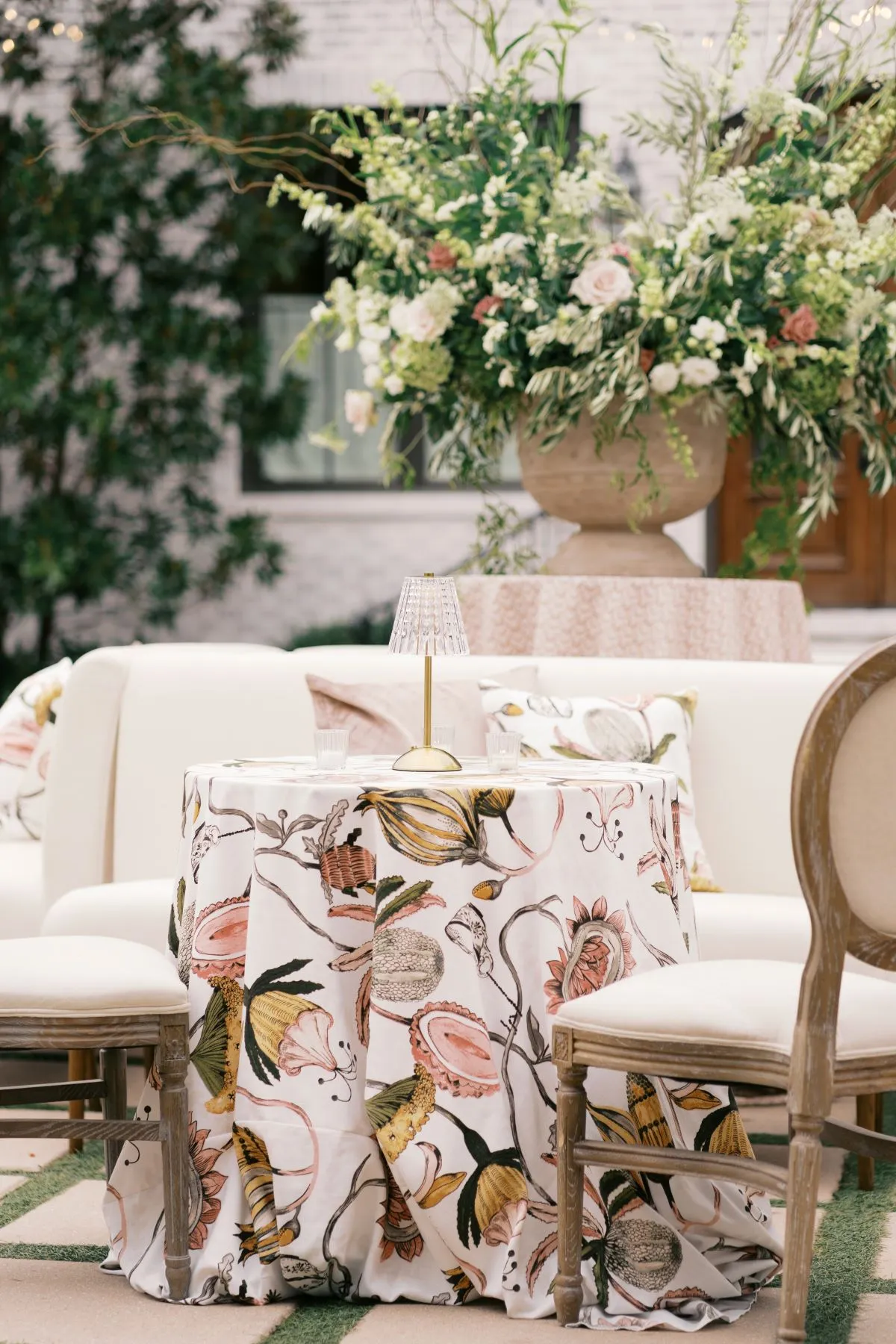
Pattern size, table shape, floral footprint, and negative space all affect how the linen-floral relationship reads. A successful color palette can still feel unbalanced when these proportions are ignored.
Pair Large Patterns With Simpler Floral Color
A large botanical motif or pronounced stripe already creates substantial movement. Florals can respond with fewer colors, tonal foliage, or a more restrained vessel. The arrangement may still be full, but its color story should remain clear.
Avoid placing a highly varied floral palette over a linen that contains several bold colors and shapes. One element should establish the visual lead.
Give Small Patterns Enough Definition
A fine stripe or small repeated motif can disappear beneath dense place settings and floral coverage. Leave enough visible linen around the arrangement and between place settings for the pattern to register.
If the pattern carries a useful bridge color, make sure it remains visible near the floral arrangement. This allows guests to see the intended relationship rather than experience the pieces as separate choices.
Protect Negative Space
Not every open area needs flowers, candles, menus, glassware, or another decorative object. Visible linen gives the composition breathing room and allows its color or pattern to contribute fully.
Negative space can be particularly valuable on patterned linens and long tables. It separates floral groupings and prevents the design from becoming one continuous band of competing detail.
Compare Long and Round Tables
Floral runners and repeated low arrangements behave differently along a long table than a central arrangement does on a round table. Linen patterns also change when draped across a large round surface or repeated along a rectangular one.
The floral designer and rental team should review the exact table shape and dimensions. Arrangement width, vessel size, linen drop, place-setting footprint, and sightlines all influence the final balance.
Test the Palette in Lowcountry Light
Charleston’s natural and artificial light can reveal undertones that are difficult to see in product images. A palette should be reviewed across the period when guests will actually experience it.
Review the Linen in Daylight
Natural light may reveal green, yellow, blue, or red undertones that are less visible indoors. Compare physical samples near the venue or under similar daylight conditions whenever possible.
Look at the linen beside relevant venue finishes, such as brick, painted walls, flooring, stone, or wood. This comparison can reveal whether the palette creates the intended harmony or contrast.
Recheck the Colors at the Event Time
A late-afternoon garden may appear warm and golden, while the same setting becomes cooler and darker after sunset. Waterfront colors may also shift as reflections and sky conditions change.
Consider which stage of the event matters most visually. If guests arrive in daylight and dine after dark, the palette must work through both phases.
Test the Evening Lighting
Warm lighting can deepen olive, ochre, ruby, and gold. It may also make ivory appear creamier. Cooler lighting can mute some warm colors or reveal blue undertones in greys and greens.
Review the proposed lighting with the linen and floral samples before the palette is finalized. Lighting should support the established colors rather than correct them after installation.
Consider Clear and White Tent Roofing
Clear roofing allows surrounding colors, tree silhouettes, and evening reflections to remain part of the design. White roofing creates a more consistent field and reflects interior lighting differently.
The same linen may appear darker beneath clear roofing after sunset and brighter beneath a white tent. Tent configuration should therefore be included in the color review.
Use One Tabletop Detail to Bridge the Palette
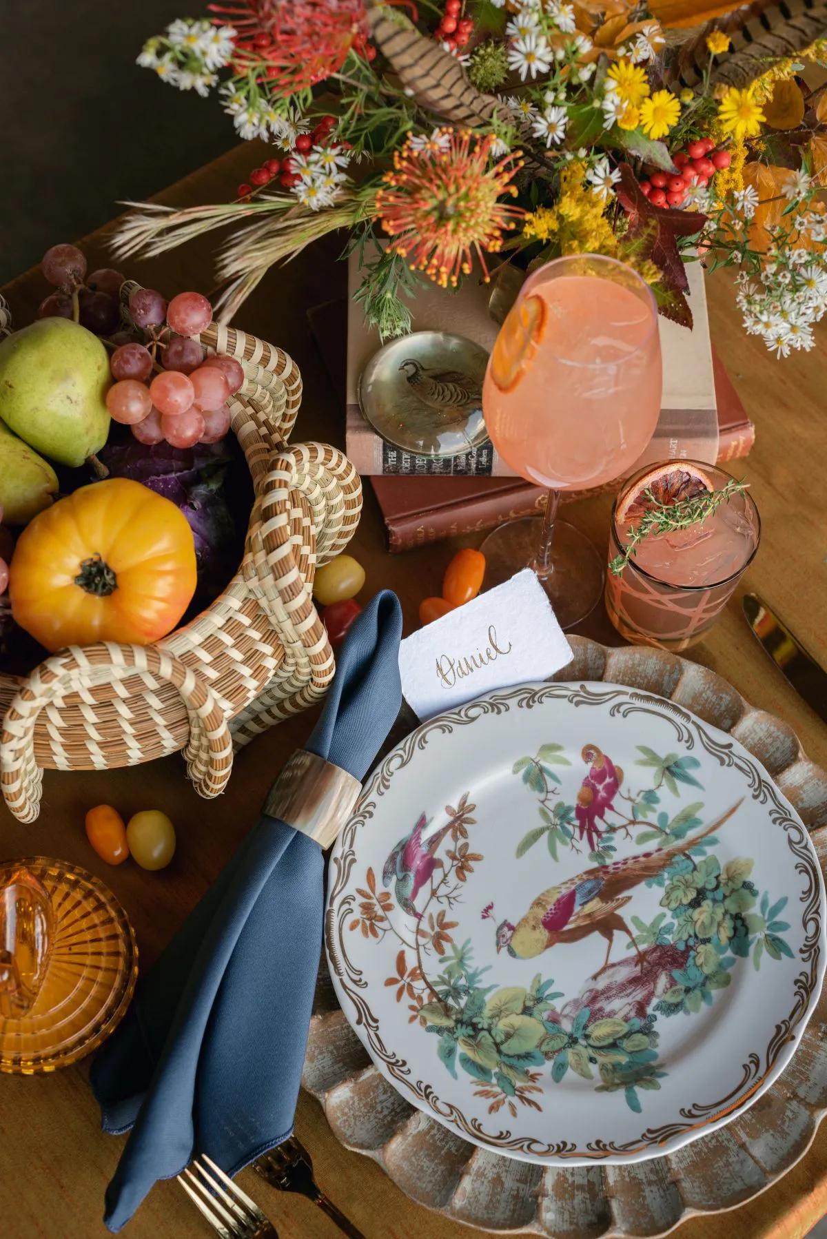
After the linen and floral relationship is established, one tabletop detail can connect them. The goal is to reinforce the palette without beginning a second color story.
Repeat a Floral Tone in the Napkin
A napkin can carry one floral color onto a neutral or contrasting tablecloth. It may also create a transition between a patterned linen and a tonal arrangement.
The napkin does not need to repeat the most dominant floral color. A secondary blush, olive, ivory, or plum tone may produce a subtler connection.
Use the Charger or Flatware Finish as a Neutral Accent
Gold, silver, black, wood, or textured chargers and flatware can support the linen and florals without introducing another strong color. Choose the finish according to the undertones already present.
Warm palettes may benefit from antique gold or wood, while indigo and dove can support silver or another cooler finish. These are design directions rather than fixed rules, and local inventory should guide the final selection.
Let Glassware Add a Controlled Color Note
Amber, smoke, green, blue, or clear glassware may reinforce an existing tone. Colored glassware should support a color already present in the linen, florals, or venue rather than introduce an unrelated accent.
Clear glassware remains useful when both the linen and floral palette carry considerable visual weight.
Bring the Rental and Floral Teams Into the Same Conversation
Linens and florals may come from different creative partners, but they occupy the same visual space. Clear information and physical samples allow both teams to work from the same palette.
Share Physical Linen Swatches
Provide the floral designer with the selected product name, physical swatch, table dimensions, planned quantity, and any relevant napkin or runner choices. This gives the designer more accurate information than a digital mood board alone.
Review Floral Samples Against the Linen
Place proposed floral colors beside the actual linen under suitable light. This can reveal undertone conflicts and show whether the arrangement needs more contrast, greater warmth, or a quieter supporting color.
Exact flower selection and availability should remain within the floral designer’s scope. The linen guide should shape the color relationship rather than prescribe particular varieties.
Confirm Table and Arrangement Dimensions
The floral designer should know the table shape and size, linen drop, place-setting footprint, number of guests per table, vessel dimensions, and sightline requirements. These factors determine how much linen remains visible and how the arrangement relates to seated guests.
Finalize Supporting Rentals After the Main Pairing
Choose glassware, chargers, napkins, flatware, and candle details after the linen-floral relationship is established. This sequence reduces the chance that a supporting item will redirect the palette.
Curated Events Charleston can provide locally available linen and tabletop options, while floral sourcing, arrangement, and installation should be confirmed with the floral designer or through the applicable planning scope.
Frequently Asked Questions
Should flowers match the table linens exactly?
No. Florals can repeat a supporting tone, remain within the same color family, or create a controlled contrast. Exact matching may reduce dimension and make the composition appear flat.
Should patterned linens be paired with simple flowers?
The floral palette should generally be more restrained when the linen carries a strong pattern. The arrangement can still have scale, form, and texture, but fewer colors will help maintain a clear hierarchy.
Which fall linen colors work well in Charleston gardens?
Olive, fern, sage, mushroom, ivory, ochre, and related tones can complement Charleston’s persistent greenery and warm seasonal light. The venue’s specific landscaping and architecture should guide the final selection.
Can blue or indigo work for a Charleston fall event?
Yes. Indigo and blue-grey connect naturally with waterways, evening skies, weathered wood, copper, and warm ivory. A Charleston autumn palette does not need to rely on orange and red.
How does venue lighting affect linen and floral colors?
Natural and artificial light can alter undertones, depth, and contrast. Review physical samples under lighting similar to the event whenever possible, including both daylight and evening conditions.
Does Curated Events provide floral arrangements?
Curated Events offers linens and other event rentals. Floral sourcing, arrangement, and installation should be confirmed with the event’s floral designer or through the applicable planning and coordination scope.
Create a Palette That Belongs in Charleston
A refined Charleston fall palette begins with the setting. Historic brick, live oak greenery, marsh grass, waterways, stone, wood, and Lowcountry light provide a richer design foundation than conventional seasonal motifs. The linen can then establish a clear field of color, while the florals create tonal harmony, controlled contrast, or one expressive statement.
Physical samples, appropriate lighting, table dimensions, and collaboration between the rental and floral teams turn that direction into a cohesive tablescape. Supporting tabletop details should reinforce the relationship rather than compete with it.
Explore the Curated Linen Collection and locally available Charleston inventory to compare olive, ochre, mushroom, ruby, indigo, fern, ivory, and patterned directions. A showroom appointment can help the event team and floral designer evaluate swatches, dimensions, and supporting rentals against the venue and overall design plan.