Washington, D.C. galas often take place in settings where architecture, history, formality, and guest experience carry equal visual weight. From museum fundraisers and institutional dinners to corporate celebrations and black-tie events, the tabletop becomes an important part of how the room feels once guests are seated.
Luxury tabletop design works best when every element contributes to one clear visual direction. China, chargers, glassware, flatware, linens, lighting, and surrounding décor should feel connected rather than selected individually. For planners creating high-profile events in the D.C. area, the goal is a table that feels intentional, polished, and appropriate for both the venue and occasion.
The following design principles and 2026 tabletop trends provide a focused approach to creating sophisticated gala settings using carefully coordinated rental pieces.
Let the Setting Lead the Tabletop Direction
A gala tabletop should respond to the room around it. Washington events can unfold inside historic buildings, modern museums, elegant hotels, private venues, ballrooms, and tented environments, each with its own architectural character.
Rather than beginning with individual plates or linens, planners can first study the setting and determine the visual language that feels most appropriate. This creates a stronger foundation for every tabletop decision that follows.
Pull Design Cues From Architecture and Interior Details
Architectural details can provide some of the most useful inspiration for a gala table. Wall treatments, flooring, ceiling details, columns, lighting fixtures, window shapes, and existing finishes can all help establish a design direction.
A room with elaborate architectural features may pair well with a cleaner tabletop that allows the venue to remain visually dominant. In a contemporary space, patterned china, sculptural glassware, or a more expressive linen can introduce depth and warmth.
The goal is not to copy the room literally. Instead, look for relationships in shape, tone, texture, and finish. A metallic detail in the architecture might inspire a flatware finish, while a strong geometric element could influence the shape of a charger or the scale of a linen pattern.
Establish the Right Degree of Formality
Formal events do not all require the same visual treatment. A diplomatic dinner may call for restrained elegance, while an arts-focused fundraiser could support a more expressive tabletop with stronger color or pattern.
Consider how guests should experience the room. A highly traditional setting might benefit from classic silhouettes and controlled detail. A fashion-forward gala may feel more appropriate with unexpected glassware, contemporary flatware, or a dramatic textile.
Formality comes from careful coordination, proportion, and presentation rather than from adding as many ornate elements as possible.
Choose One Strong Visual Idea Before Selecting Rentals
A clear design concept makes rental selection easier and helps prevent the table from becoming visually crowded.
The concept might center on tonal elegance, modern heritage, architectural contrast, sculptural simplicity, or refined color. Once that direction is established, each tabletop element can be evaluated according to whether it supports the overall idea.
This approach is especially valuable for large galas, where repeated place settings create a significant part of the room’s visual identity.
Build Visual Hierarchy Into Every Gala Place Setting
A well-designed gala table has a natural visual hierarchy. Guests should be able to take in the full setting without every element competing for attention at the same time.
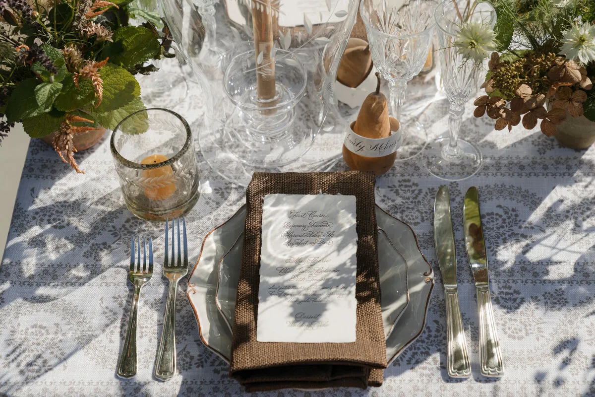
Chargers and china create the central structure, flatware frames the setting, glassware introduces height, and textiles connect the individual pieces to the larger table. When these components are chosen as a coordinated composition, the finished setting feels sophisticated without appearing overly styled.
Define the Silhouette With Chargers and China
The charger establishes the footprint of the place setting and often becomes one of its strongest visual anchors. Its shape, finish, and edge treatment can immediately shift the character of the table.
A detailed china pattern can sit beautifully over a simple charger, allowing the plate to remain the focal point. The opposite approach can also work, with understated china layered over a more distinctive charger that provides texture, metallic detail, or contrast.
For tonal designs, subtle variations in shade and surface can create enough depth without relying on dramatic color changes.
Create Edge Contrast Through Flatware
Flatware helps define the outer frame of each setting. Its finish and silhouette can either reinforce the existing aesthetic or introduce a controlled point of contrast.
Slim, clean-lined flatware can sharpen an ornate table. A warmer metallic finish may soften a restrained palette, while more traditional profiles can bring familiarity to a contemporary setting.
Rather than treating flatware as a final functional selection, planners can use it to connect surrounding details such as candleholders, chargers, furniture finishes, or other metallic accents within the room.
Build Vertical Rhythm With Glassware
Glassware brings height and transparency to a table, which makes it particularly important in large gala spaces. Repeated across dozens of settings, stemware can create an elegant rhythm that reads clearly from across the room.
Different silhouettes can introduce subtle movement, while colored glassware can add dimension to an otherwise neutral composition. Clear glass remains effective when the table already includes strong patterns or several decorative layers.
The number and placement of glasses should still feel visually balanced. Too many competing shapes can make the place setting feel busy, especially when paired with detailed china and textured linens.
Finish the Composition With a Deliberate Napkin Detail
Napkins have a stronger visual role than they are often given. Their placement, fabric, color, and fold can help connect the tabletop layers while bringing softness to the place setting.
A napkin placed across the plate can introduce a vertical or horizontal line within the setting. A side placement can allow decorative china or a statement charger to remain fully visible.
For highly detailed tables, a restrained napkin treatment often works best. When the place setting is simpler, the napkin can carry more texture or color.
2026 Tabletop Directions That Suit High-Profile D.C. Galas
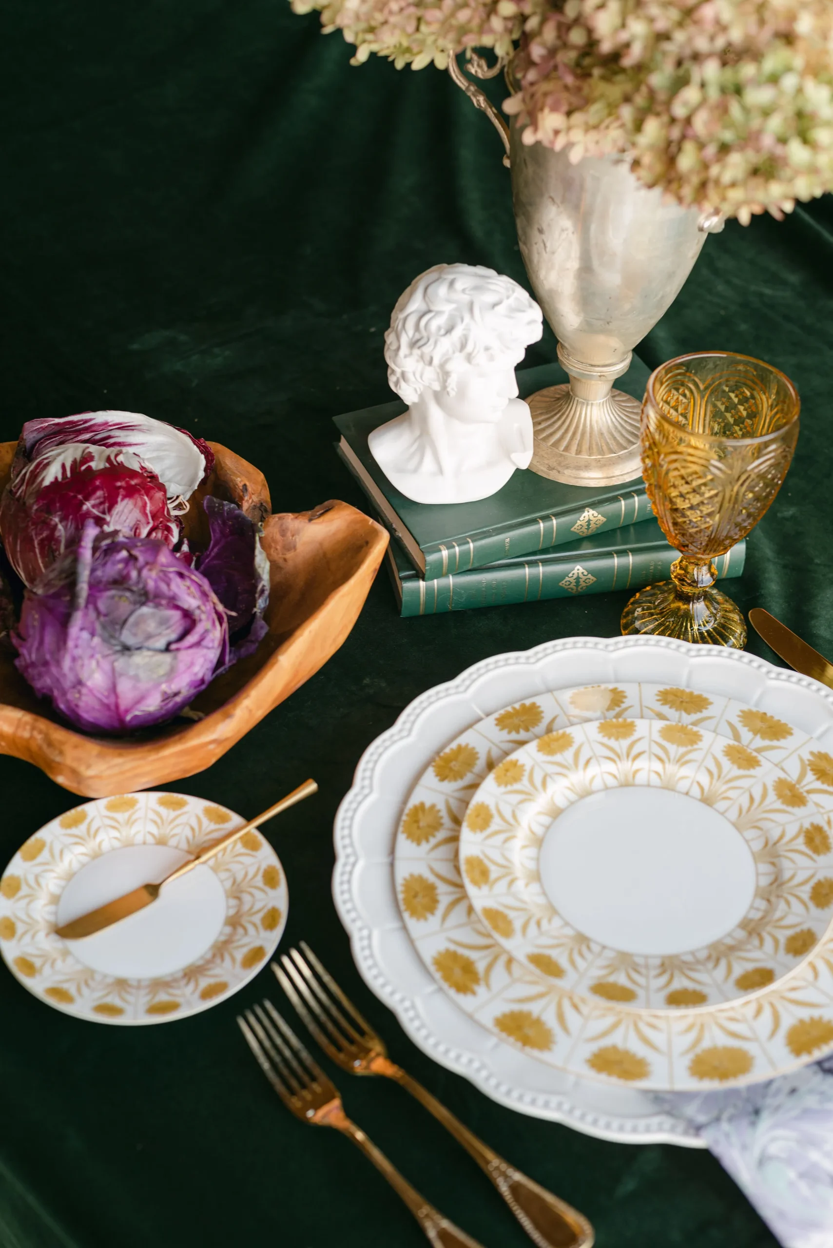
In 2026, luxury tabletop design continues to favor carefully edited combinations rather than perfectly matched sets. The strongest gala tables feel layered, but every layer has a reason for being there.
For Washington, D.C. events, these trends can be interpreted with enough restraint to preserve the sophistication expected at formal fundraisers, institutional gatherings, corporate dinners, and cultural celebrations.
Layer Tonal Colors Instead of Matching Every Element
Tonal palettes can create depth without overwhelming the table. Rather than selecting one exact color for the linen, napkin, china, and accessories, planners can work with several related shades.
Cream, ivory, soft stone, warm metallics, or deeper variations of a chosen event color can establish a richer visual field. Differences in texture and finish keep the table from appearing flat.
This direction works particularly well in formal settings because it creates dimension while maintaining a controlled overall appearance.
Use Pattern as a Controlled Focal Point
Pattern can give a gala table personality, but its placement matters.
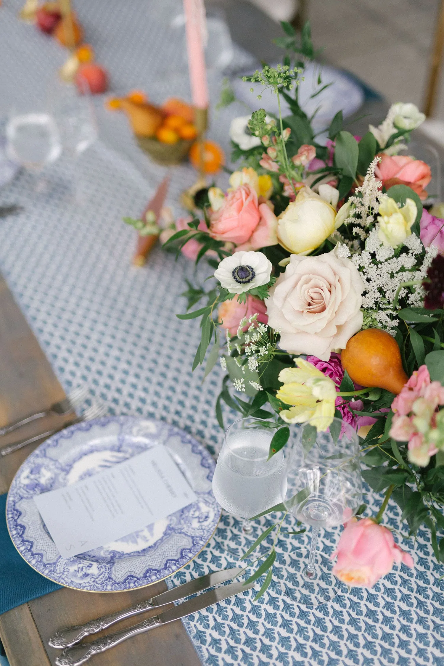
A patterned china collection may serve as the main decorative feature, supported by a quieter linen and restrained glassware. Alternatively, a bold textile can establish the character of the table while simpler china and flatware provide balance.
Using pattern selectively allows guests to notice the detail without losing the clarity of the place setting.
Introduce Color Through Glassware for Measured Drama
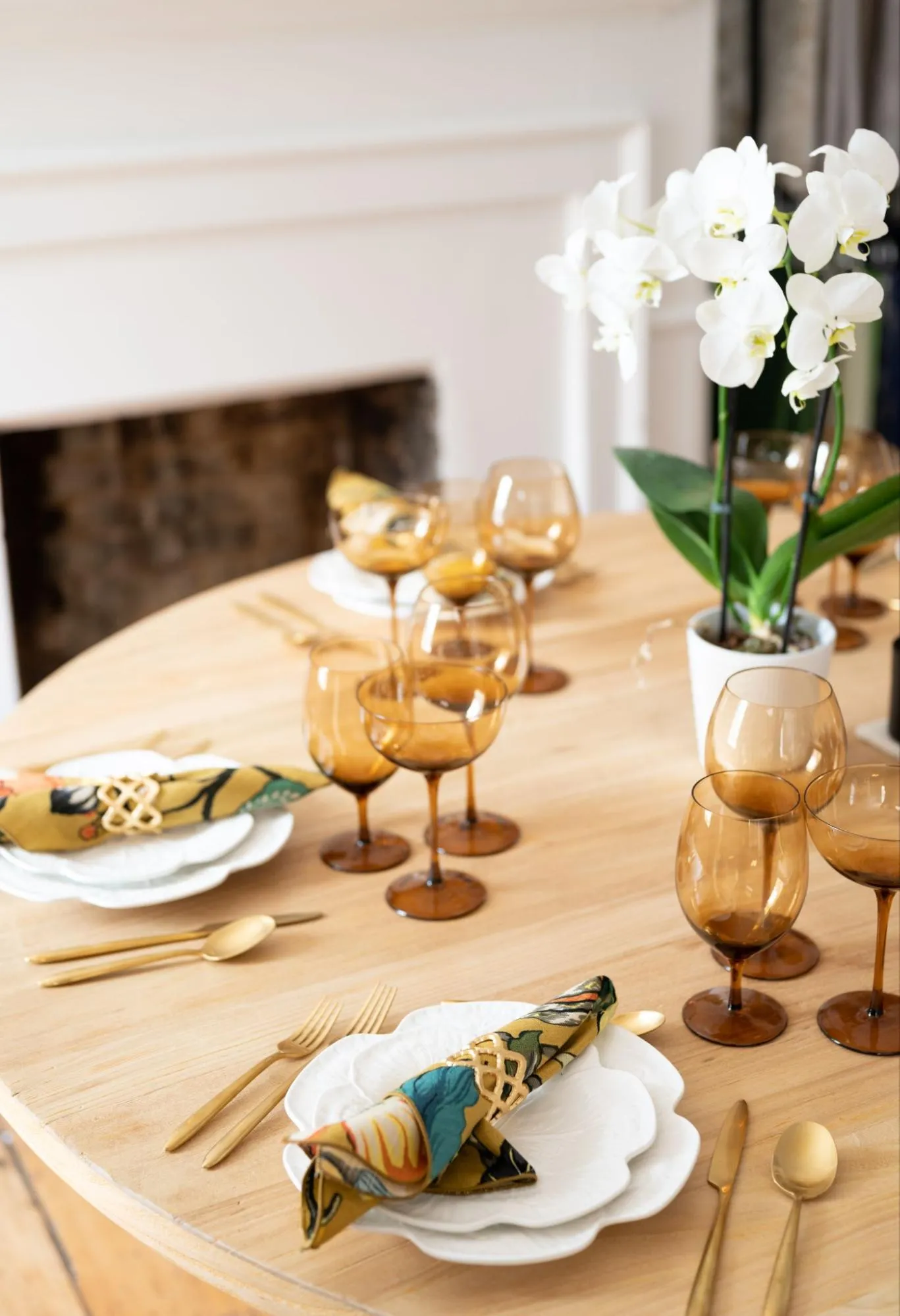
Colored glassware offers an effective way to bring color into a tabletop without committing the entire design to a bold palette.
A distinctive glass can become an accent against neutral linens and classic china, or it can reinforce a shade already present in florals or décor. Because glass catches surrounding light, even a subtle tint can have a noticeable effect across a ballroom.
This is particularly useful for planners who want a modern visual statement while keeping the overall table elegant.
Combine Classic Forms With One Contemporary Finish
A traditional gala table can feel current when one familiar element is paired with a more modern counterpart.
Classic china might be combined with streamlined flatware. Traditional stemware may sit alongside a charger with a contemporary profile. A formal place setting can also gain freshness from an unexpected linen texture or sharper napkin treatment.
The most successful combinations rely on one or two meaningful contrasts rather than turning every item into a statement.
Style the Table Around the Purpose of the Gala
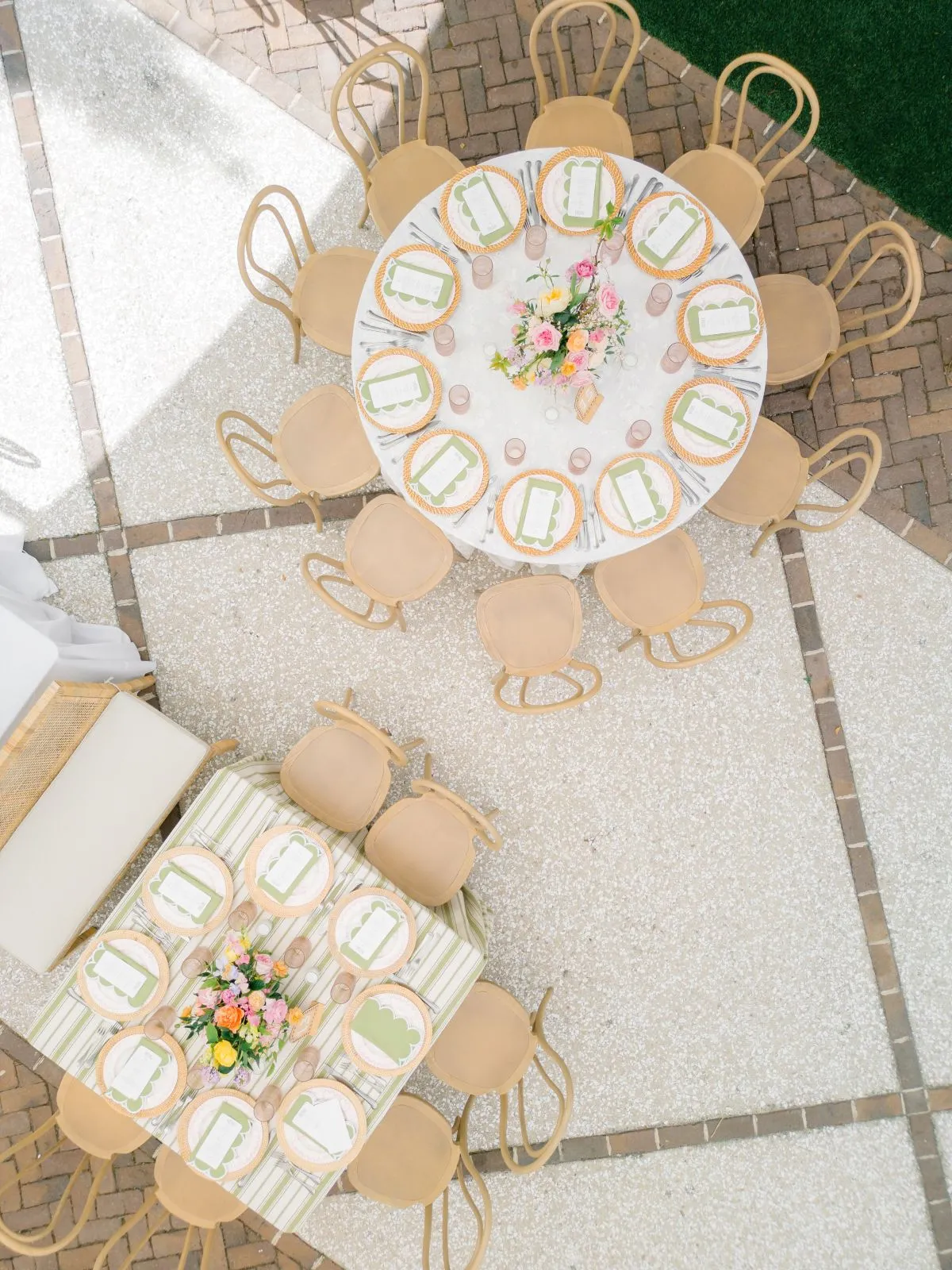
A Washington gala often carries a clear institutional, cultural, philanthropic, or corporate purpose. The tabletop should support that identity without becoming overly literal.
Luxury design feels more thoughtful when the event’s purpose influences the atmosphere, color direction, and degree of formality. This allows each gala to develop its own visual language instead of relying on a standard formula for upscale events.
Create Composed Elegance for Fundraising and Donor Dinners
Fundraising events often need to feel elevated while remaining warm enough to encourage conversation and connection.
A composed setting can be achieved through controlled layering, sophisticated finishes, and one or two memorable details. For example, distinctive glassware may add character while classic china keeps the table grounded.
The finished design should communicate importance while still creating an inviting dining environment for donors, guests, and organizational leaders.
Give Cultural and Institutional Galas a Sense of Place
Museums, universities, cultural organizations, and other institutions may have architectural details, collections, histories, or visual identities that can subtly influence the tabletop.
A color drawn from the venue, a patterned plate that references an artistic direction, or a textile with a level of formality suited to the institution can create a meaningful connection.
These references work best when they remain refined. Literal motifs and heavy theming can quickly overpower the sophistication of the event.
Translate Corporate Identity Without Over-Branding the Table
Corporate galas and awards dinners can acknowledge a company’s identity without covering the room in exact brand colors or logos.
A brand color might appear through napkins or selected glassware, while the remaining tabletop uses neutral or complementary tones. Metallic details can reference an organization’s visual language without feeling overly promotional.
This gives the table a sense of identity while preserving the atmosphere expected at a formal evening event.
Control Visual Weight Through Linens and Texture
Linens cover one of the largest visual surfaces in a gala room, making them a central design decision rather than a background choice.
The right textile can soften the room, introduce pattern, add depth to a monochromatic scheme, or give simple tabletop pieces a more distinctive setting. The key is determining whether the linen should command attention or support another feature.
Decide Whether the Linen Should Lead or Recede
When a linen has a strong pattern, distinctive texture, or rich color, it may become the visual foundation of the entire table. In that case, surrounding rentals can be edited to give the textile enough space.
If detailed china, statement glassware, or a bold charger already serves as the focal point, a quieter linen may create better balance.
Both approaches can feel luxurious. The choice depends on where the eye should land first.
Pair Pattern With Intentional Restraint
Pattern works best when it has visual room around it.
A patterned linen can be paired with simpler plates and more restrained glassware, while detailed china may look stronger against a quieter textile. Combining several patterns can also work, but their scale and intensity should differ enough to prevent competition.
A large-scale textile pattern, for example, may sit comfortably beneath china with a smaller or more delicate motif when the colors remain coordinated.
Use Texture to Add Depth to Restrained Palettes
Neutral and monochromatic gala tables can still feel rich when texture is used thoughtfully.
Woven details, subtle sheen, dimensional fabrics, and varied surfaces create depth even when the color palette stays narrow. These differences become particularly visible under evening lighting.
Texture is therefore useful for planners who want an understated table with enough detail to remain visually interesting at both close range and across the room.
Balance Soft Textiles Against Polished Tabletop Surfaces
Part of the appeal of a luxury tabletop comes from contrast between materials.
The softness of linen creates a natural counterpoint to smooth china, reflective glass, metallic flatware, and polished chargers. When those surfaces are balanced, the table feels layered without relying on excessive decoration.
Thinking in terms of material relationships can often produce a more sophisticated result than simply adding another color or accessory.
Design the Table for Candlelight, Photography, and the Full Room View
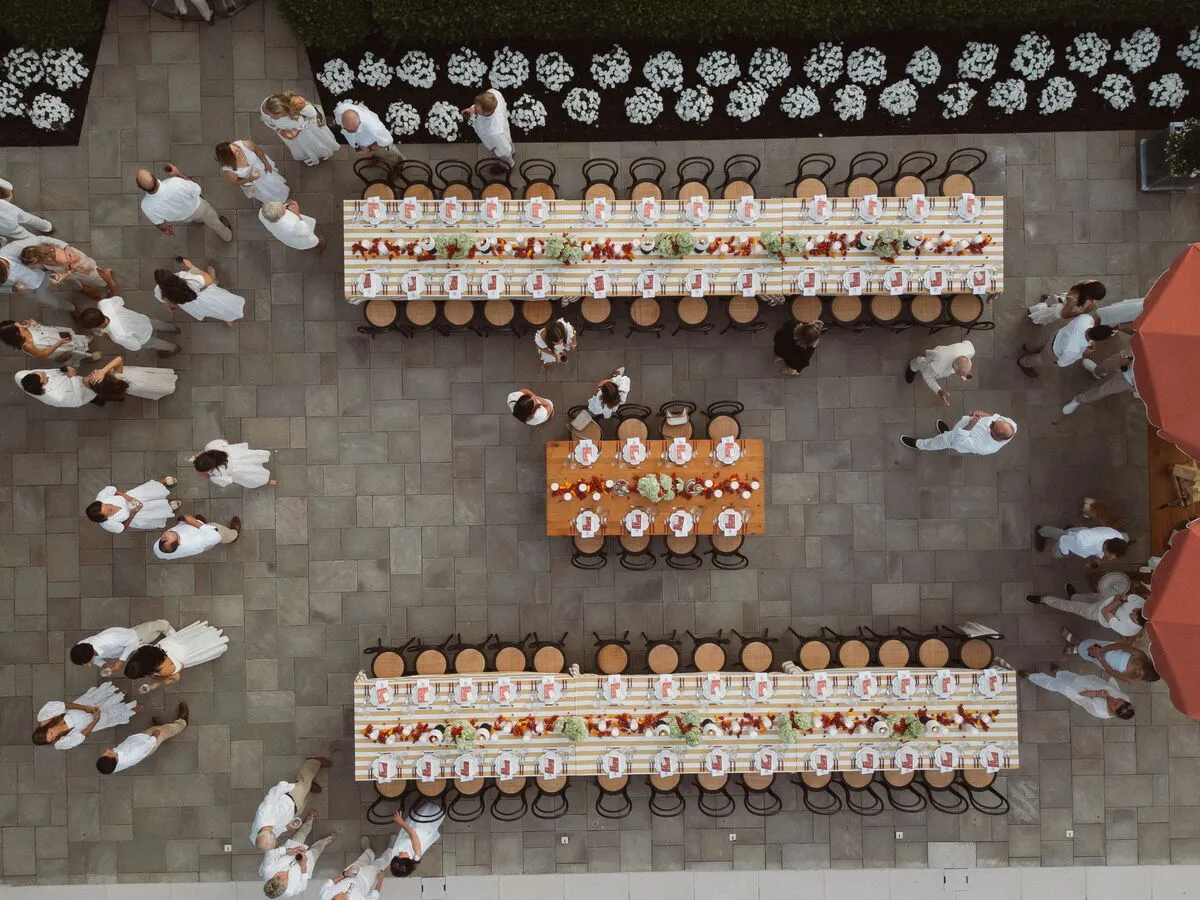
A gala table is viewed at several different scales. Guests see the details directly in front of them, photographers capture close compositions, and the room itself presents dozens of repeated place settings at once.
A strong design should perform well from all three perspectives. This requires attention to light, repetition, scale, and the way materials interact throughout the evening.
Consider How Finishes Respond to Evening Light
Glass, metallic finishes, glossy china, and textured textiles react differently under candlelight and event lighting.
Reflective surfaces can add sparkle and movement to a formal room, but too many highly reflective elements may compete for attention. Matte or softly textured pieces can create visual relief and allow selected metallic or glass details to stand out.
Planners should consider these relationships when choosing tabletop pieces, especially for evening galas where lighting plays a major role in the atmosphere.
Create Repetition That Reads Across the Room
Individual place settings should contribute to a larger room composition.
A repeated charger shape, colored glass, napkin detail, or consistent metallic finish can create visual rhythm across long tables and multiple rounds. These repeated elements help the tabletop remain recognizable even when viewed from the entrance or across a ballroom.
This approach is especially effective for large events where guests experience the room before they notice individual table details.
Preserve Detail at the Guest’s Eye Level
Large-scale impact matters, but guests eventually experience the setting from only a few feet away.
Fine china patterns, decorative edges, subtle linen texture, distinctive flatware profiles, and carefully selected glassware become more noticeable once attendees are seated.
These details give the table richness without requiring oversized decorative elements.
Design for Photographs Without Designing Only for Photographs
High-profile galas are frequently photographed, and the tabletop often appears in event galleries, social content, press coverage, and organizational materials.
Strong contrast, layered surfaces, and distinctive place-setting details can photograph beautifully, but they should still work for the guests using the table.
Avoid crowding a setting simply to create a dramatic image. Space, proportion, and clarity help the table look refined both in photographs and in person.
Use Curated Events’ Collection as a Complete Design Palette
Luxury tabletop rental decisions become easier when planners can evaluate the entire composition together. Curated Events offers tabletop and linen options that allow china, chargers, glassware, flatware, and textiles to be considered as parts of one cohesive design.
This approach helps planners move beyond selecting pieces individually and instead refine how each material, color, finish, and silhouette relates to the surrounding elements.
Compare Complete Place Settings Instead of Isolated Pieces
A beautiful rental piece does not automatically belong in every design.
A charger may look striking on its own but feel too dominant beneath highly patterned china. Colored glassware may appear subtle individually but become much more visually prominent when repeated across a full ballroom.
Building complete combinations allows planners to evaluate proportion, contrast, and hierarchy before the event.
Use the Showroom to Refine Scale, Finish, and Contrast
Seeing tabletop pieces together can reveal relationships that are difficult to evaluate individually.
Differences between warm and cool metallic finishes, the scale of a china pattern, the transparency of colored glass, and the texture of a linen can all affect the final composition.
A showroom setting gives planners an opportunity to compare these elements in context and refine the design before finalizing the tabletop direction.
Work With an Event Consultant to Edit the Final Combination
Luxury design often improves through editing.
An experienced event consultant can help determine whether the table needs another layer or whether one should be removed. They can also help identify combinations that reinforce the event’s aesthetic while maintaining balance across china, chargers, glassware, flatware, and linens.
This collaborative approach is particularly useful for complex galas where the tabletop must coordinate with the venue, floral design, lighting, and broader event environment.
Frequently Asked Questions
What tabletop rentals are typically used for a formal Washington, D.C. gala?
Formal gala tabletops often include chargers, china, flatware, water and wine glassware, linens, and napkins. The exact combination should reflect the dining format, venue, overall design direction, and level of formality.
How can planners make a gala table feel luxurious without making it overly ornate?
Focus on quality, proportion, and one clear visual hierarchy. A strong charger, distinctive glassware, refined flatware, or textured linen can provide enough character without requiring every tabletop element to be decorative.
Should china and chargers match at a formal gala?
They do not need to match exactly. Contrast can create a more sophisticated place setting when the colors, finishes, or shapes still feel connected. Detailed china may work best with a simpler charger, while understated china can support a stronger charger design.
Can different glassware styles or colors be combined on one table?
Yes. Mixing glassware can create height, color, and visual rhythm when the silhouettes and shades are intentionally coordinated. The overall setting should still feel balanced rather than assembled from unrelated pieces.
How should linens coordinate with patterned china?
Consider which element should carry the stronger visual statement. Detailed china usually benefits from a quieter linen, while a patterned textile can be balanced with simpler dinnerware. When both include pattern, differences in scale and a shared color connection can help keep the combination cohesive.
What tabletop details have the greatest visual impact in a large gala room?
Chargers, linens, glassware, and repeated napkin details tend to read clearly across a large room because they create consistent shapes, color, and rhythm. Smaller china and flatware details become more important once guests are seated.
Conclusion
Successful luxury gala tabletop design comes from thoughtful composition. The venue, purpose of the event, china, chargers, flatware, glassware, linens, lighting, and surrounding décor should work together to create a setting that feels intentional from every perspective.
For high-profile Washington, D.C. events, restraint and strong visual hierarchy often create the most memorable results. A carefully chosen statement piece, balanced by complementary textures and finishes, can give the entire room a distinctive point of view.
Curated Events helps planners bring those ideas together through a wide range of luxury tabletop and linen rentals, showroom inspiration, and experienced design guidance. By evaluating the complete setting rather than choosing each piece in isolation, planners can create gala tables that feel polished, cohesive, and distinctly suited to the occasion.