Crafting the perfect event atmosphere starts with one powerful design element: color. Understanding color theory can elevate your decor strategy from ordinary to extraordinary. In this guide, you’ll explore how to use the color wheel, decode the emotional impact of different hues, and apply purposeful color schemes that bring your event vision to life. With practical insights and real-world examples, you’ll gain the tools to design visually captivating and emotionally engaging spaces—tailored to leave a lasting impression on every guest.
Key Takeaways
- Color theory is essential for creating harmonious and emotionally impactful event spaces.
- Strategic use of lighting colors can significantly influence attendee mood and engagement.
- Monochromatic schemes create elegant atmospheres and improve accessibility for color-blind attendees.
- Before-and-after transformations demonstrate the power of color theory in event design.
The Color Wheel: A Foundational Tool in Event Design

The color wheel is a cornerstone of event decor, offering a clear, visual guide to understanding how colors relate and interact. Event planners rely on this fundamental design tool to build cohesive palettes that evoke specific emotions and enhance the atmosphere of a space. Whether aiming for bold contrasts or subtle harmony, the structure of the color wheel helps in selecting complementary, analogous, or contrasting hues that work seamlessly across various event elements.
Color psychology deepens this approach, allowing planners to influence mood through intentional color choices. Warm tones like red and orange infuse energy and excitement, while cooler shades such as blue and green promote calm and serenity. Even secondary colors—like vibrant magenta or rich teal—can introduce a modern edge and visual interest to a space.
Advancements in technology have made color planning even more precise. Digital tools, including interactive color wheels and palette generators, empower designers to explore, test, and refine color combinations quickly. These innovations ensure consistent coordination across lighting, linens, floral arrangements, and other decor components—making color not just a design choice, but a strategic element in creating immersive event experiences.
Understanding Color Meaning to Influence Atmosphere

Color is more than decoration—it’s a language that speaks to emotion, perception, and behavior. In event design, understanding the deeper meaning behind each hue allows planners to curate environments that align with the event’s purpose and evoke the desired emotional response from guests.
The Emotional Power of Color
Beyond visual appeal, color holds the power to shape how guests feel, interact, and remember your event. By understanding the psychological associations of different hues, event planners can intentionally design spaces that support the desired mood and message.
Calming vs. Energizing Hues
Colors like blue and green often evoke calmness and serenity, making them ideal for corporate settings or wellness-focused events. On the other hand, vibrant tones such as red and orange energize the space, drawing attention and encouraging engagement—perfect for social gatherings or product launches. Each color choice subtly influences guest behavior, mood, and even movement through the venue.
Using Color Strategically in Event Design
Using these psychological insights, designers can guide focus toward key areas, reinforce brand identity, and support storytelling throughout the event experience. When applied thoughtfully, color becomes a strategic asset—transforming decor into a dynamic tool for engagement and emotional impact.
Implementing Color Schemes Effectively in Event Decor

The strategic use of color schemes is essential to shaping a cohesive and emotionally engaging event experience. By applying core principles of color theory, event designers can influence mood, guide guest interaction, and support an event’s theme or branding. Whether the goal is energy, elegance, or harmony, each type of color scheme offers unique advantages that elevate visual storytelling.
Analogous Color Schemes: Seamless Harmony
Analogous color schemes draw from three to five hues that sit side by side on the color wheel—such as blue, blue-violet, and violet. This creates a unified, calming effect perfect for intimate gatherings or events that require visual cohesion. Warm combinations (like red, orange, and yellow) can foster feelings of energy and enthusiasm, while cooler tones (such as blue and green) promote relaxation and focus.
This scheme is especially effective for brand-driven events, allowing designers to incorporate multiple shades of a company’s primary color while maintaining a polished and professional aesthetic.
Key Advantages:
- Promotes visual unity and flow
- Evokes specific emotional tones through subtle variation
- Ideal for corporate, wellness, or art-focused events
Triadic Color Schemes: Bold and Balanced Energy
Triadic schemes use three colors evenly spaced around the color wheel, such as red, yellow, and blue. This high-contrast yet balanced approach creates vibrant, energetic environments without overwhelming the viewer. By choosing one dominant hue and using the other two as accents, planners can maintain harmony while infusing the space with creative flair.
Triadic palettes are ideal for events that seek to impress—such as brand launches, galas, or fundraisers—where color can be used to energize the space and spark interest.
Design Tips:
- Select one main color and two supporting shades
- Apply the scheme to lighting, floral elements, and décor features
- Use neutrals to ground bold hues for visual comfort
Monochromatic Color Schemes: Refined Elegance
Monochromatic color schemes rely on varying tints, tones, and shades of a single hue to create an elegant and cohesive visual environment. This minimalist approach simplifies color coordination and delivers a sophisticated look, ideal for formal events such as weddings or black-tie affairs.
In addition to visual refinement, monochromatic schemes enhance accessibility—particularly for color-blind attendees—by using contrast in lightness and texture rather than relying on multiple hues.
Best Applications:
- Creates a calm, luxurious ambiance
- Enhances visual consistency
- Supports intuitive spatial flow and inclusivity
Complementary & Split-Complementary Schemes: Visual Contrast with Harmony
Complementary color schemes pair two colors directly opposite on the color wheel, such as blue and orange. This bold contrast grabs attention and evokes strong emotional responses, making it well-suited for dynamic or theatrical events.
For a softer take, split-complementary schemes use a base color plus the two hues adjacent to its opposite. This offers visual interest without the full intensity of direct complements, allowing for balance and versatility.
Design Benefits:
- Delivers striking visuals that stand out
- Highlights focal points (e.g., stages, centerpieces, signage)
- Works well for product unveilings, themed parties, or immersive experiences
The Psychology of Color in Shaping Event Atmosphere

Color psychology is a powerful tool in event design, enabling planners to create intentional atmospheres that influence how guests feel, interact, and remember an experience. Each color carries psychological associations that evoke specific emotional responses—making color a strategic element in crafting environments that align with an event’s goals.
Interpreting the Emotional Impact of Color
Every hue has the ability to shape perception. Warm colors like red, orange, and coral infuse spaces with energy, passion, and excitement—ideal for stimulating conversation or drawing attention to key focal points. In contrast, cool tones such as blue, green, and lavender foster calm, trust, and serenity, making them suitable for networking events, wellness-focused gatherings, or corporate functions.
Yellow, associated with optimism and creativity, can brighten a room and lift the overall mood. Understanding these emotional triggers allows event planners to select colors that encourage the desired guest behaviors—whether it’s sparking engagement, promoting relaxation, or inspiring connection.
Aligning Color Choices with Event Themes and Objectives
Effective color selection goes beyond aesthetics—it serves the event’s message. Vibrant hues like electric pink, lime green, or tangerine are well-suited for entertainment-driven events or brand activations where boldness is key. Conversely, muted palettes with cool grays, soft blues, and deep greens help establish a sense of professionalism and calm for conferences or formal receptions.
Color temperature also plays a critical role in atmosphere. Warm tones bring intimacy and vibrancy, while cool tones offer clarity and spaciousness. By aligning these choices with the tone and purpose of the event, planners can create cohesive, immersive environments that feel intentional and impactful from the moment guests arrive.
Practical Tips for Applying Color Theory in Event Decor

Successfully applying color theory in event design goes beyond selecting attractive hues—it’s about using color strategically to shape emotion, guide movement, and create a cohesive, memorable experience. From lighting to floral arrangements, every design element is an opportunity to influence how guests feel and interact within the space. The following tips highlight how color can be applied practically and effectively throughout your event decor.
Using Lighting Colors to Shape Mood
Lighting is one of the most powerful ways to set the emotional tone of an event. Specific hues can alter the energy of a room, helping to relax, excite, or inspire attendees. Thoughtful color choices in uplighting, ambient lighting, and spotlighting can amplify an event’s theme and deepen its impact.
- Blue lighting fosters calm, clarity, and relaxation—ideal for networking lounges or wellness events.
- Red lighting stimulates excitement and energy, making it effective for entertainment zones or receptions.
- Green lighting evokes balance and renewal, often used for eco-conscious or nature-inspired themes.
- Yellow lighting promotes optimism and creativity, suitable for celebratory or artistic gatherings.
Triadic or complementary lighting schemes can be used to create contrast and highlight focal areas like stages or installations. When coordinated across entryways, seating areas, and interactive zones, lighting enhances spatial rhythm and emotional continuity.
Harmonizing Table Settings and Floral Arrangements
Tabletop elements—such as linens, florals, centerpieces, and chargers—offer a prime opportunity to unify your color palette. Event designers can apply analogous or complementary color schemes to create a balanced, visually engaging tablescape that aligns with the broader event design.
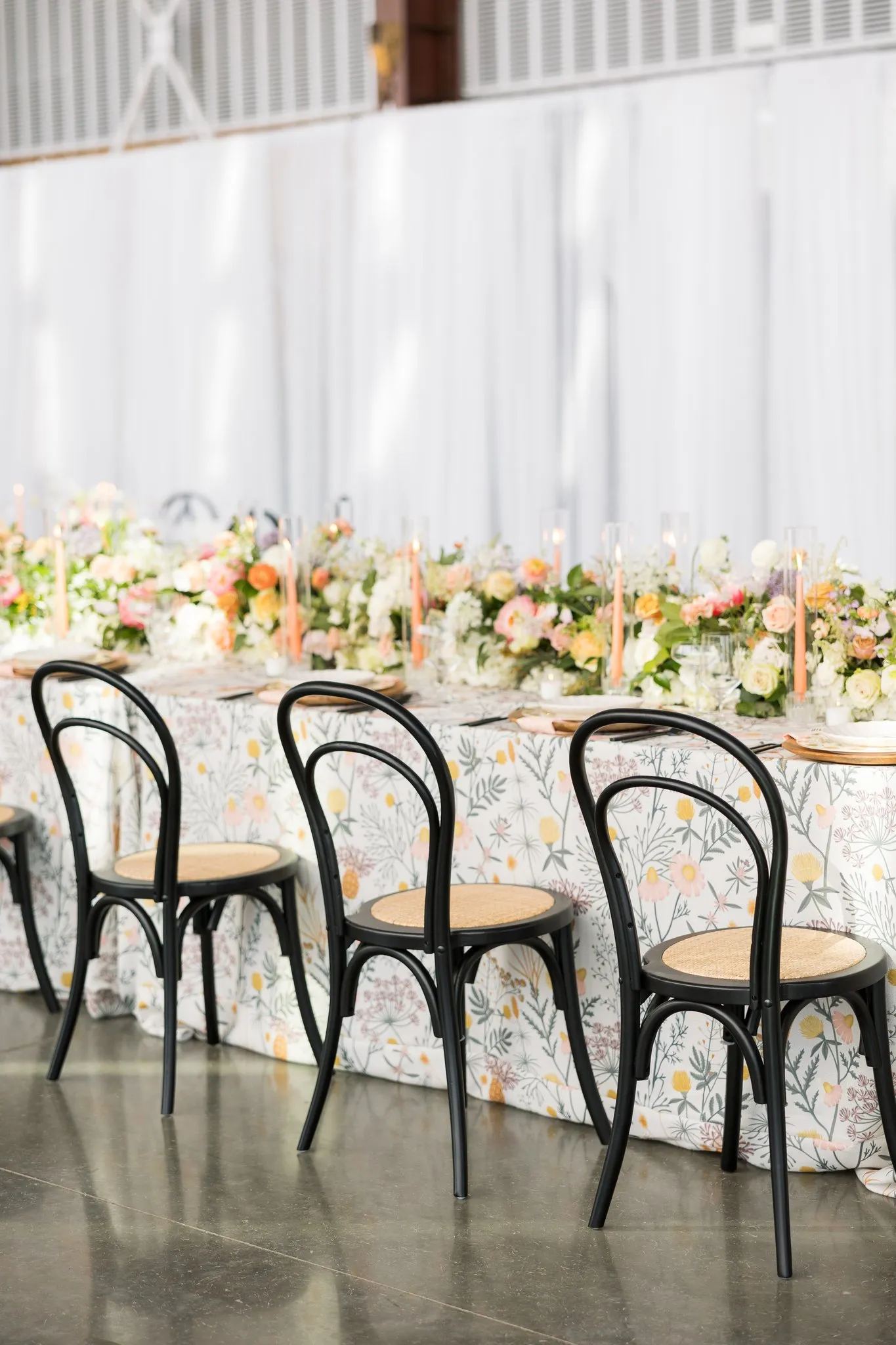
For example, combining blush pink florals with rose gold accents and soft peach linens evokes a romantic, cohesive tone. Alternatively, pairing navy tablecloths with gold runners and white blooms creates striking contrast with a classic, upscale feel. The key is consistency and alignment across textures, tones, and centerpiece heights to support both aesthetic harmony and guest experience.
Creating Visual Flow Through Strategic Color Placement
Color isn’t just decorative—it’s directional. When used strategically in spatial design, it can subtly guide guests through the venue, signal important areas, and create visual rhythm. Lighter or pastel hues can be used in corridors and transitions to create openness and movement, while bolder, saturated tones draw attention to feature areas such as stages, installations, or interactive zones.
Accent walls, floor lighting, or colored decor markers (like fabric drapes or floral arches) can act as navigational cues. This use of color to influence flow and orientation supports a smooth and immersive event experience, helping guests move intuitively from one moment to the next.
Conclusion
Color theory is more than a design concept—it’s a strategic asset for event planners seeking to create meaningful, immersive experiences. By understanding the psychological influence of color and applying intentional color schemes, planners can shape atmospheres that evoke emotion, enhance brand messaging, and elevate the overall guest experience.
From lighting and florals to spatial layout and table design, thoughtful color application brings cohesion, clarity, and impact to every detail. When used effectively, color transforms venues into emotionally resonant environments that reflect the event’s purpose and leave a lasting impression.
Mastering color theory empowers event professionals to turn creative vision into unforgettable reality—making every gathering not just visually appealing, but truly memorable.


