Velvet and textured linens can give an autumn wedding reception depth, warmth, and visual definition. Their impact, however, depends on how deliberately they are placed. Covering every table in the strongest fabric can make a room feel visually heavy, particularly when the reception already includes detailed florals, statement lighting, distinctive chairs, or historic architecture.
A more effective approach begins with hierarchy. One table may carry a rich velvet cloth, while guest dining tables use quieter textures or related colors. A pattern may appear on selected tables, then return through napkins, runners, or placemats elsewhere in the room. This allows each textile to serve a clear purpose rather than asking every table to compete for attention.
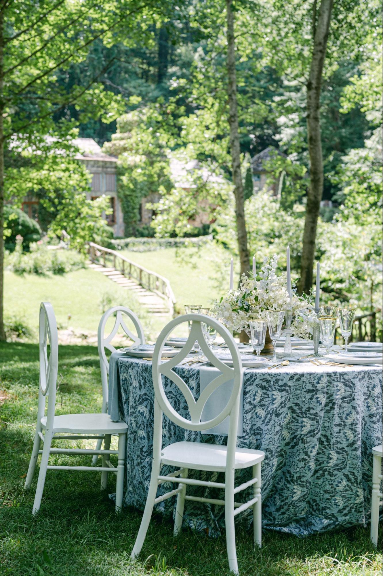
Curated Events Charleston offers linens across color categories that include blues, greens, purples, warm neutrals, blushes and reds, whites and ivories, and floral or geometric patterns. Its Curated Linen Collection also includes solid, striped, floral, bordered, and dimensional designs that can be used to create a varied but connected reception.
For a Charleston fall wedding, the strongest linen plan should respond to the venue, table function, floral scale, tabletop pieces, and transition from daylight into evening.
Start With a Linen Hierarchy, Not One Fabric for Every Table
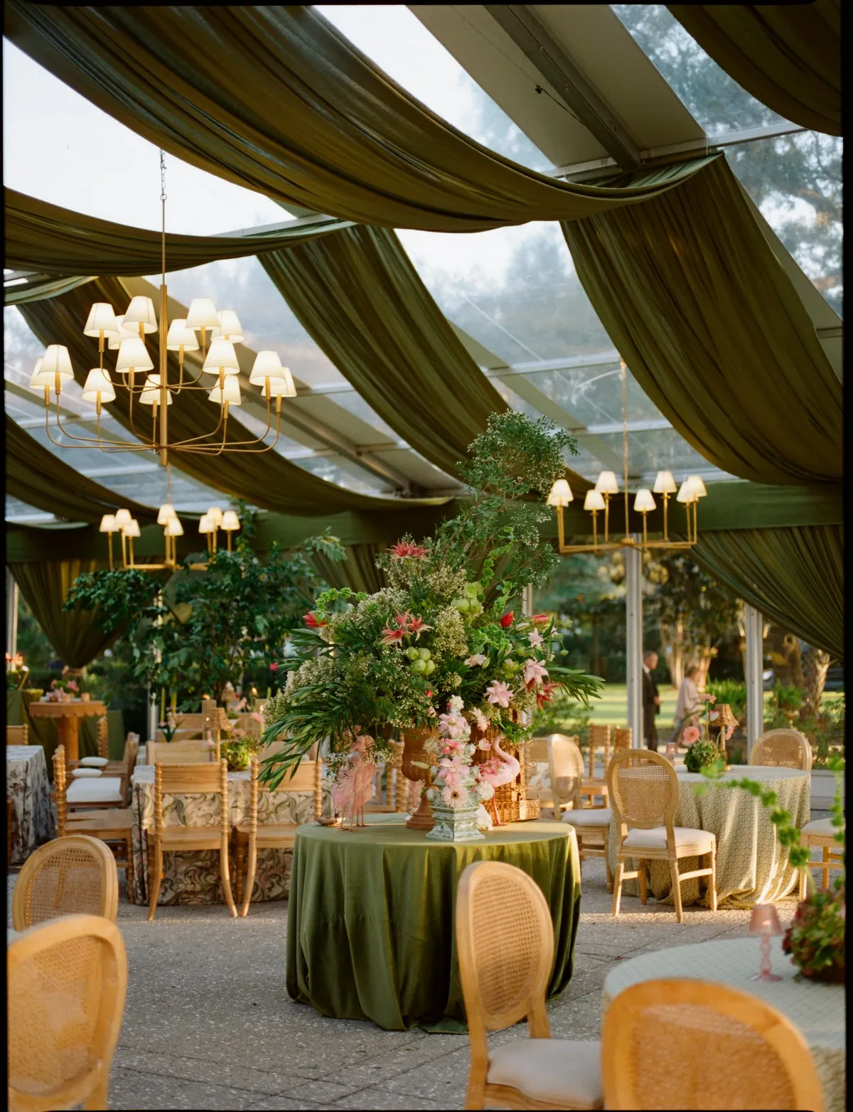
A cohesive reception does not require every table to use the same cloth. In many settings, repeating one substantial fabric across the entire room can reduce its impact rather than strengthen it.
Before selecting individual linens, determine which tables should command attention and which should support the wider design. This establishes a visual order that guests can understand as they enter and move through the reception.
Give Each Table a Visual Role
Begin by identifying the tables guests are most likely to notice first. These may include a sweetheart table, head table, long central dining table, cake table, or another arrangement positioned along the primary view into the reception.
These focal tables can carry the strongest texture, deepest color, or most recognizable pattern. Supporting guest tables can then use related textiles that provide contrast without appearing disconnected.
The room should be evaluated from its entrance and major circulation points. A linen that appears dramatic when viewed up close may disappear against a dark wall, patterned floor, or heavily landscaped background. Conversely, several strong cloths placed beside one another may overwhelm the architecture or floral design.
Giving every table a defined role helps prevent these conflicts. One linen establishes the primary statement, while surrounding tables extend the palette through quieter materials and smaller textile details.
Decide Where Full Velvet Will Have the Most Impact
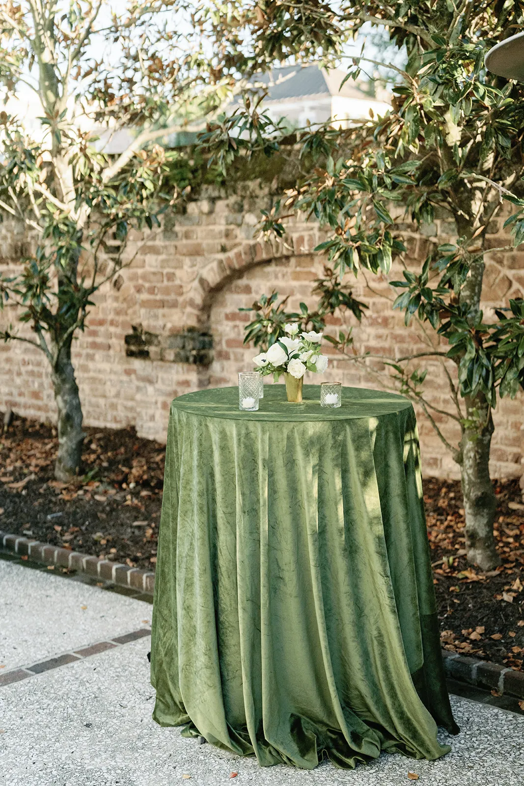
Velvet is particularly effective on tables that remain stationary and occupy a prominent position throughout the reception. Its weight and directional surface allow it to absorb and reflect light differently as guests move around the room.
A full velvet cloth may work well on:
-
A sweetheart table placed against a lighter backdrop
-
A head table at the center of a tented reception
-
A round statement table near the main entrance
-
A cake or display table with a restrained decorative arrangement
-
A selected dining table that anchors a wider group
A sweetheart table placed against a lighter backdrop
A head table at the center of a tented reception
A round statement table near the main entrance
A cake or display table with a restrained decorative arrangement
A selected dining table that anchors a wider group
Curated Events Charleston’s published inventory includes velvet linens in Copper, Champagne, Bone White, and Navy, providing options that range from warm neutrals to deeper, more architectural colors.
The strongest placement is generally one where enough of the fabric remains visible after florals, place settings, candles, and chairs have been added. If nearly the entire surface will be covered, the visual effect of the velvet may be lost.
Build Supporting Tables Around Quieter Textures
Supporting guest tables do not need to be plain, but they should not duplicate the visual weight of the focal cloth.
Subtle weaves, soft patterns, smooth solids, or restrained floral designs can provide depth without making the room feel crowded. A color used on the focal velvet table might return through guest-table napkins, bordered placemats, or a quieter cloth with a related undertone.
For example, a Copper velvet focal table could be surrounded by warm ivory or champagne guest tables. Navy velvet might be balanced with pale blue, indigo pattern, or bone-white foundational linens. An olive or fern pattern could be supported by quieter green napkins or neutral tablecloths.
This approach makes the focal textile more visible while preserving continuity across the room.
Match the Fabric Weight to the Table’s Function
Not every reception table performs the same job. A sweetheart table serves as a visual focal point and may hold relatively few place settings. A guest dining table must accommodate plates, glassware, flatware, florals, candles, menus, and service access. A cake table may be viewed primarily from a distance.
The linen should be selected according to how the table will function once the room is fully set.
Use Full-Length Velvet on Stable Focal Tables
Velvet works best when its drape can remain undisturbed and visible. A full-length cloth may create a strong sense of structure around a sweetheart table or central display because the fabric becomes part of the table’s silhouette.
Before confirming velvet, review:
-
How the cloth falls around the table legs
-
Whether the corners will gather evenly
-
How much fabric remains visible beneath the tabletop arrangement
-
Whether the table will need to be moved during the event
-
How close the cloth sits to guest and service routes
How the cloth falls around the table legs
Whether the corners will gather evenly
How much fabric remains visible beneath the tabletop arrangement
Whether the table will need to be moved during the event
How close the cloth sits to guest and service routes
Velvet should not pool excessively in an aisle or near a place where catering staff must work repeatedly. It should feel substantial without creating unnecessary bulk around the base of the table.
Choose Dimensional Fabrics That Support Guest Dining
Guest dining tables often benefit from texture that is visible but less dense than velvet. Woven, embroidered, striped, floral, or softly raised surfaces can add character while leaving enough visual space for tabletop elements.
The scale of the design matters. A large floral or geometric repeat may work beautifully on a broad round or rectangular table but become difficult to read once place settings are added. A smaller or more controlled pattern may suit tables with detailed china, layered glassware, or substantial centerpieces.
Curated Events’ Charleston linen categories include florals and geometric designs as well as a broader Curated Linen Collection with options such as Emerson Olive, Greer Fern, Jayden Indigo Floral, Kathryn Ruby, Onyx Stripe, Palm Gold, Ruby Stripe, and Savannah Sage.
These fabrics can be used to create interest across guest tables without relying on velvet as the only source of dimension.
Introduce Texture Through Smaller Textile Elements
When a full textured tablecloth would be too dominant, smaller textile pieces can provide a controlled alternative.
Velvet or patterned napkins can bring color closer to each place setting. A runner can establish a defined line down a long table while leaving the surrounding surface visible. Placemats, cuffs, bordered napkins, and other accents can repeat a color or material without covering the entire table.
Curated Events Charleston organizes its linen inventory to include full linens, napkins, runners, cuffs, sashes, and skirting, allowing texture to be introduced at several scales.
These smaller applications are also useful for connecting tables. A fabric used as a full cloth on the primary table might reappear as a napkin or runner on supporting tables, creating a clear relationship without repeating the complete design.
Interpret the Charleston Setting Through Texture
Charleston wedding venues range from formal interiors and historic courtyards to sailcloth tents, estate lawns, gardens, and waterfront properties. The appropriate amount and type of texture will vary with each setting.
The linen should respond to the property rather than impose a generic autumn theme that could belong anywhere.
Add Controlled Richness to Historic Interiors and Courtyards
Historic architecture already contains texture. Brick, plaster, millwork, stone, ironwork, fireplaces, and detailed flooring may all be visible within one room or courtyard.
In these spaces, velvet or pattern should be used with discipline. One deep-colored table or a controlled traditional stripe may add richness without competing with the property. Surrounding tables can remain quieter so the architecture continues to frame the event.
A Navy, Copper, Champagne, or Bone White velvet cloth could each perform differently in such a setting. Navy may provide contrast against pale walls, while Champagne can support an interior with warm wood or gilded detail. Bone White may allow architectural color and floral design to remain more prominent.
Strong patterns can also work, but they should have a clear relationship to the room. A composed stripe or floral repeat will usually appear more intentional than several unrelated textures distributed across the same space.
Give Tented Garden Receptions More Visual Depth
A light tent interior can provide a clean foundation, but it can also make tables appear visually flat if every cloth is pale and smooth.
Texture helps give the dining area greater dimension. Olive, fern, ochre, champagne, copper, muted floral, or striped fabrics can establish separation between the tables and the tent interior while remaining connected to the surrounding garden.
Options listed within the Curated Linen Collection include Eloise Ochre, Emerson Olive, Greer Fern, Savannah Sage, Palm Gold, Olive Stripe, and several floral designs.
These colors and patterns allow the reception to acknowledge the landscape without copying it literally. The goal is not to recreate leaves, branches, or harvest imagery on every surface. Instead, the linen can interpret the garden through color temperature, botanical pattern, and natural variation.
Use Coastal Color Without Creating a Nautical Theme
Waterfront and island weddings often begin with pale blues, greens, whites, or neutral tones. Velvet and deeper patterned textiles can add enough weight to prevent the design from appearing overly light or summery.
Navy velvet can anchor a pale coastal palette, while Jayden Indigo Floral, Lotus Indigo, Ocean Rain Dots, Savannah Sage, or another softened blue-green textile can introduce pattern and movement.
These choices can reference the Lowcountry environment without relying on obvious nautical decorations. The venue’s water views, landscape, and natural light already establish a sense of place. The textiles should support those features through color and texture rather than adding themed symbols.
Clear glassware, ivory plates, lighter florals, and restrained metallic details can help balance a darker linen in waterfront settings.
Build an Autumn Palette From Undertones Rather Than Clichés
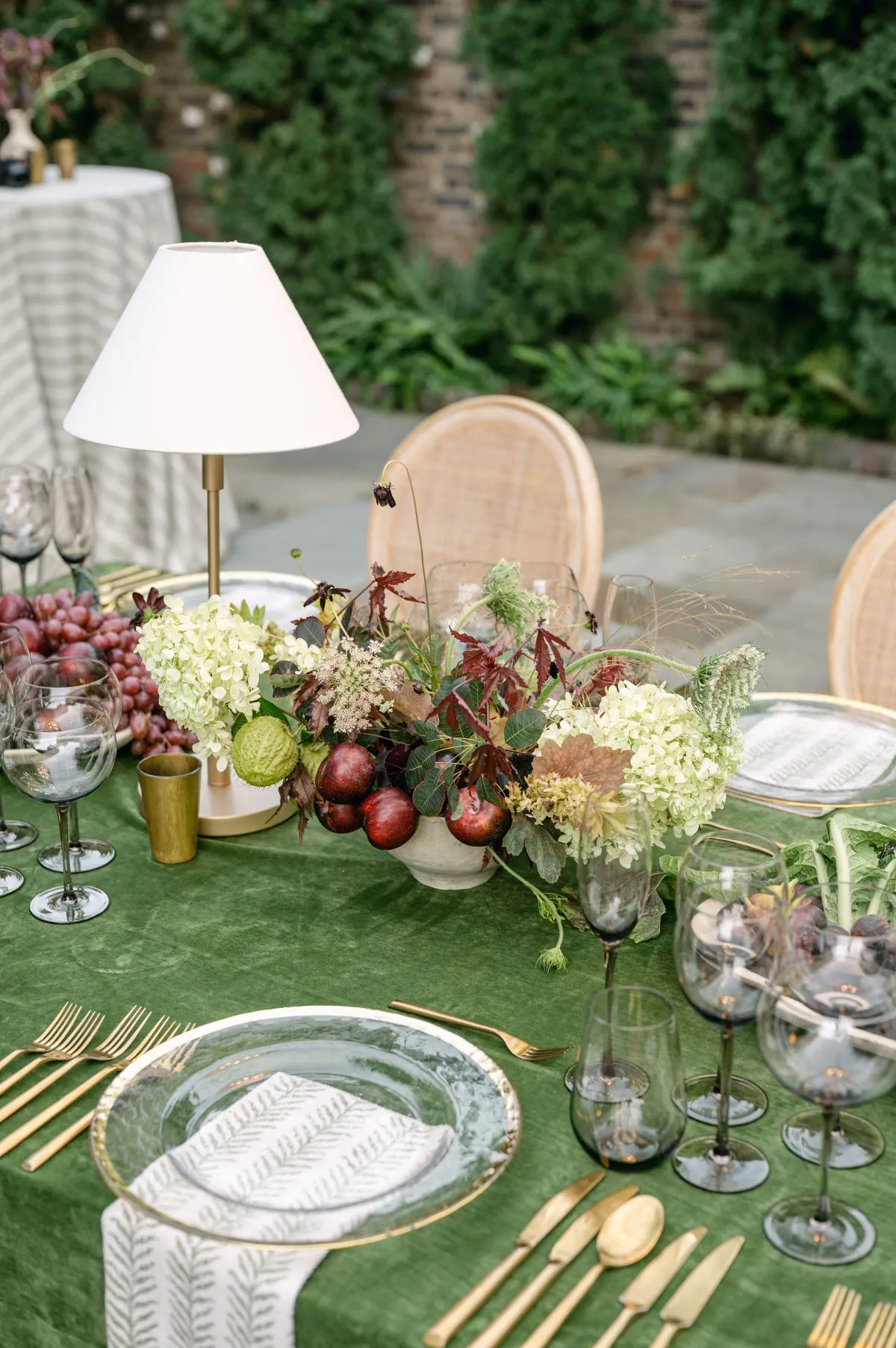
A Charleston autumn wedding does not have to be limited to bright orange, brown, and red. Seasonal warmth can come from undertone, texture, contrast, and the way the fabric responds to evening light.
Curated Events Charleston organizes linen options across broad color families, including greens; golds, champagnes, and neutrals; blushes, pinks, and reds; blues; purples; whites and ivories; and floral or geometric patterns.
This makes it possible to create an autumn palette that feels layered and specific to the venue.
Use Champagne, Gold, Copper, and Ivory for Warmth
Warm neutrals can give an autumn reception depth without relying on literal seasonal decorations.
Champagne velvet introduces softness and subtle reflection, while Copper velvet creates a stronger focal point. Bone White can balance those warmer colors and prevent the room from becoming too saturated.
These tones work well with:
-
Antique or brushed metallic flatware
-
Clear or softly tinted glassware
-
Ivory china
-
Warm candlelight
-
Florals in muted rose, cream, burgundy, peach, or foliage-led palettes
Antique or brushed metallic flatware
Clear or softly tinted glassware
Ivory china
Warm candlelight
Florals in muted rose, cream, burgundy, peach, or foliage-led palettes
When several reflective finishes are being used, one quieter textile should provide balance. A lustrous cloth, metallic charger, gold flatware, reflective glassware, and numerous candles may become visually busy when placed together without a matte or neutral element.
Explore Olive, Fern, and Sage for Garden Settings
Green can function as a foundational autumn color rather than appearing only through florals and foliage.
Emerson Olive, Greer Fern, and Savannah Sage represent different approaches to a green-led palette within the Curated Linen Collection.
Olive can create a deeper, more grounded setting, while fern and sage may feel softer against ivory tents, garden surroundings, or historic architecture. These colors can be paired with champagne, cream, muted gold, warm wood, or carefully selected patterns.
Exact matching is not necessary. Using several related green undertones usually creates greater depth than repeating one identical shade across the linens, florals, chairs, and tabletop pieces.
Introduce Ruby, Navy, or Indigo as Controlled Depth
Darker textiles can anchor a large tent, pale courtyard, or formal dining room. They are most effective when their placement is controlled and the surrounding objects provide sufficient contrast.
Navy velvet can frame a focal table, while Kathryn Ruby or Jayden Indigo Floral may introduce deeper color through a pattern.
Against these textiles, lighter china, clear glassware, ivory candles, or softly colored florals can preserve visibility. Repeating the dark tone through smaller details elsewhere in the reception can connect the room without making every table equally intense.
It is also important to evaluate darker linens after sunset. A rich color that appears dimensional in daylight may look nearly flat if the evening lighting does not reveal its surface.
Combine Patterns and Solids With a Clear Priority
Patterned and solid linens can work together when one is clearly dominant.
A patterned focal table may be surrounded by solids drawn from one or two colors within the design. Alternatively, a velvet focal table can be paired with patterned guest linens or napkins that introduce movement around it.
Curated Events’ collection includes options such as Onyx Stripe, Ruby Stripe, Olive Stripe, Palm Gold, Jayden Indigo Floral, and multiple botanical or geometric designs.
The presence of the wedding colors is not enough to justify a pattern. Its scale, contrast, and relationship to florals and tabletop pieces should also support the complete table composition.
Balance a Strong Linen With the Rest of the Table
A textured linen is only one layer of the table. Florals, candles, glassware, flatware, china, menus, chargers, and seating will all affect whether the final setting feels balanced.
The more active the linen becomes, the more restrained some of the surrounding elements may need to be.
Adjust Floral Scale to the Linen
Large or densely patterned fabrics need enough visible surface to remain recognizable. If an elaborate centerpiece covers most of the table, the pattern may become fragmented or disappear entirely.
With a strong patterned cloth, consider:
-
Cleaner floral silhouettes
-
Fewer competing colors
-
Controlled vessel shapes
-
Open space around the centerpiece
-
A lower concentration of decorative objects
Cleaner floral silhouettes
Fewer competing colors
Controlled vessel shapes
Open space around the centerpiece
A lower concentration of decorative objects
A quiet velvet or solid cloth can support more complex florals because the textile provides a stable background. Even then, enough of the fabric should remain visible for its color and surface to influence the design.
The arrangement should also be reviewed from seated eye level. A table may look balanced from above while feeling crowded or obstructed to guests.
Use Tabletop Pieces to Create Contrast
Contrast allows each element to remain visible.
Matte velvet can be paired with clear glassware, glazed china, or polished flatware. A patterned cloth may require simpler plates and chargers, while a quiet linen can support more decorative tabletop pieces.
Against Navy, Ruby, or other dark fabrics, lighter china and transparent glassware help maintain definition. On Champagne or Copper velvet, tabletop finishes should be selected carefully so they do not disappear into the cloth. For more detail, see our article Seasonal Fabrics: From Velvet Drapes to Breezy Summer Linens.
Candlelight can add another layer of reflection. The interaction among flames, glass, metal, and velvet should be tested as a complete setting rather than evaluated one item at a time.
Connect the Linen to Seating Without Exact Matching
Chairs frame the table and influence how the linen color is perceived. They do not need to match the cloth exactly.
A patterned table may benefit from a cleaner wood, metal, cane, or acrylic chair. Velvet can be balanced with natural wood or a structured chair silhouette. Upholstered seating can work, but the colors and textures should not compete with the tablecloth. We cover this further in Event Tablecloth And Table Linen Style Guide.
A small repeated detail, such as a cushion, trim color, or material finish, is often enough to connect the chair to the table.
Matching the cloth, napkin, chair, centerpiece, and other details in one identical shade can make the design appear flat. Related colors and materials create more depth.
Evaluate Drape and Proportion Before Choosing the Fabric
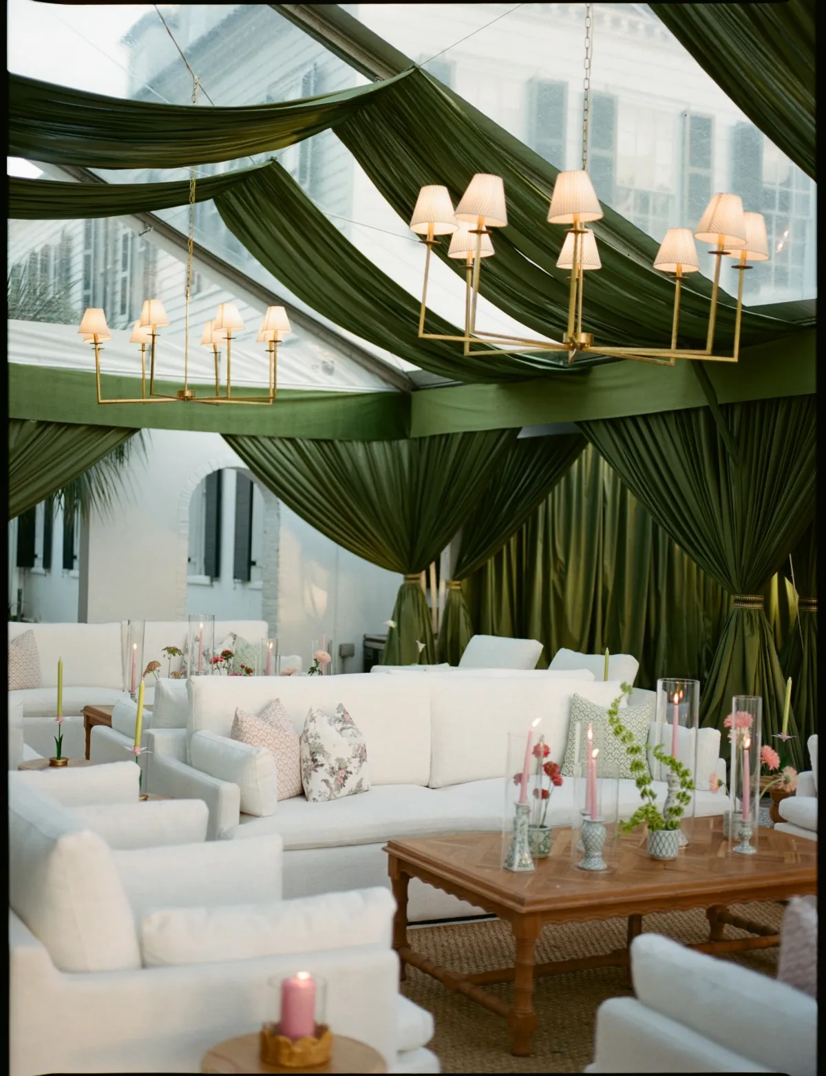
The correct color does not guarantee the correct linen. Size, drop, seam placement, pattern direction, and fabric behavior all influence how the cloth appears on the actual table. You may also find Elevate Your Event with Luxury Linen Rentals in Chesapeake helpful.
Curated Events Charleston’s velvet inventory includes pieces in several round and rectangular sizes, underscoring the need to confirm the intended table size before selecting the linen. For more detail, see our article Festive Linen Finishes to Elevate Holiday Party Decor.
Confirm the Table Dimensions and Desired Drop
The linen should be matched to the actual table rather than a general label such as “round” or “rectangular.”
Determine whether the cloth should:
-
Reach the floor evenly
-
Stop above the floor
-
Create a deliberately longer drape
-
Leave part of the table visible
-
Be used as an overlay or accent rather than full coverage
Reach the floor evenly
Stop above the floor
Create a deliberately longer drape
Leave part of the table visible
Be used as an overlay or accent rather than full coverage
Velvet may gather differently from lighter fabric, particularly at the corners of rectangular tables. Excess material can create unnecessary pooling around the base, while an insufficient drop can make the table feel unfinished.
The surrounding floor plan also matters. A longer cloth may work on a focal table positioned against a wall but become impractical in a narrow guest aisle.
Judge Pattern Scale on the Complete Table
Patterns should be evaluated at the table’s full dimensions.
A large repeat may need a broad uninterrupted surface to remain visible. On a smaller table, only fragments of the design may appear between the plates and centerpiece. Directional stripes also need to align appropriately with the table shape and orientation.
When the same patterned linen will appear on several tables, step back and consider the repetition across the room. A pattern that looks elegant on one table may become visually overwhelming when repeated dozens of times.
Consider the View From Across the Room
Linen samples are often viewed from close range, but most guests initially see the tables from several feet away.
Step back from the sample setting and determine whether:
-
The texture remains visible
-
The pattern can still be understood
-
The color separates from the floor and backdrop
-
The cloth relates clearly to nearby tables
-
The focal linen is distinguishable from the supporting fabrics
The texture remains visible
The pattern can still be understood
The color separates from the floor and backdrop
The cloth relates clearly to nearby tables
The focal linen is distinguishable from the supporting fabrics
Photographing the setting from the entrance, side aisles, and seated positions can reveal issues that are less obvious when standing beside the table.
Check the Linen From Daylight Through Evening
Many Charleston weddings begin during daylight and continue well after sunset. Velvet, embroidery, metallic thread, and raised weaves can change significantly as the available light shifts.
The linen should therefore be reviewed under conditions that approximate both the beginning and later portion of the reception.
Review the Fabric in Natural Light
Natural light reveals undertones that may be difficult to see in a product image or indoor showroom.
A neutral linen may appear warmer, cooler, greyer, or more yellow depending on the surrounding walls, tent material, landscape, and time of day. Velvet may also change in appearance as the light moves across its surface.
Review whether the fabric:
-
Remains distinct from a white or clear tent
-
Relates well to the venue’s permanent colors
-
Appears too bright or muted outdoors
-
Shows its pattern clearly in direct or diffused light
-
Changes dramatically when viewed from another direction
Remains distinct from a white or clear tent
Relates well to the venue’s permanent colors
Appears too bright or muted outdoors
Shows its pattern clearly in direct or diffused light
Changes dramatically when viewed from another direction
This is particularly important for closely related shades such as ivory, champagne, bone, sage, and muted gold.
Repeat the Review Under Evening Illumination
After sunset, dark textiles may lose visible texture, while reflective fabrics can appear brighter than expected.
Review the cloth under a light temperature similar to the one planned for dinner. Check whether velvet still shows depth, whether a floral or stripe remains legible, and whether metallic details produce excessive glare.
Candles should also be included in the review. Their light may enrich velvet and warm-toned fabrics, but it can change how glassware, flatware, and glossy patterns appear.
Use a Complete Sample Rather Than a Swatch Alone
A swatch is useful for comparing color and texture, but it does not show how the linen will behave across the full table.
Whenever possible, build a representative sample with:
-
The intended table type
-
The selected cloth
-
Napkins or placemats
-
China and chargers
-
Glassware and flatware
-
Candles
-
An approximate floral palette and scale
-
The planned chair style
The intended table type
The selected cloth
Napkins or placemats
China and chargers
Glassware and flatware
Candles
An approximate floral palette and scale
The planned chair style
The table should be viewed from standing, seated, and across the room. Any adjustments should be made to the complete composition rather than assuming the linen is responsible for every imbalance.
Create Rhythm Through Strategic Linen Placement
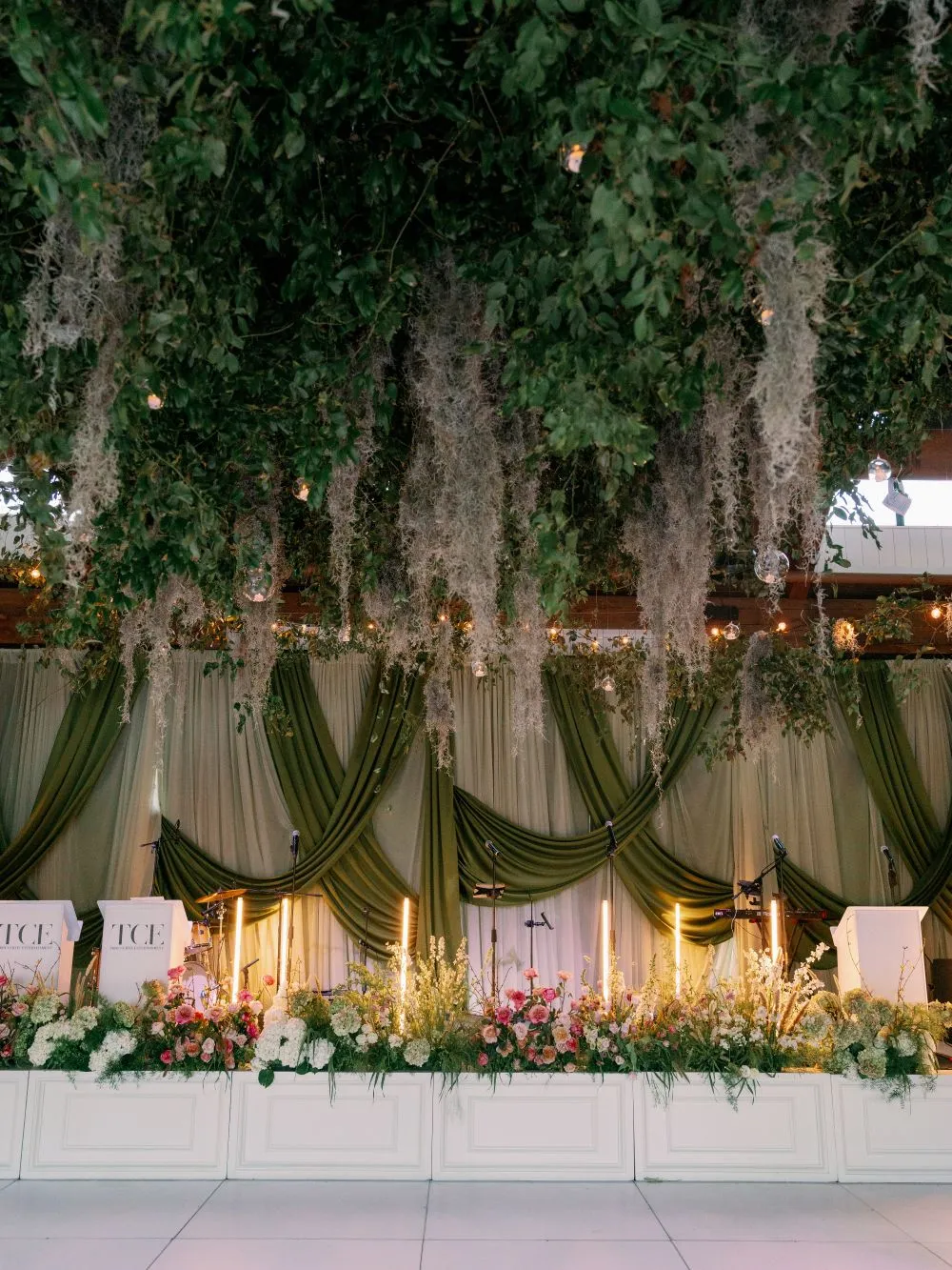
After the individual fabrics have been selected, their placement should be mapped across the reception.
Without a clear distribution plan, the strongest linens may cluster in one area, appear randomly between tables, or compete with one another.
Establish the Primary Linen Moment
Choose the table that will carry the most visually important textile.
Its placement should consider:
-
Visibility from the reception entrance
-
Relationship to the dance floor or main dining area
-
Background color and architecture
-
Nearby florals and lighting
-
The role of the table during the event
Visibility from the reception entrance
Relationship to the dance floor or main dining area
Background color and architecture
Nearby florals and lighting
The role of the table during the event
The strongest linen should support an important reception moment. Placing another equally dominant cloth directly beside it may reduce the impact of both.
Repeat the Design in Smaller Increments
The primary linen can be repeated elsewhere through smaller details.
A velvet color may return in napkins. A patterned cloth may appear again as a runner or placemat. A solid color drawn from a floral design can be used across surrounding guest tables.
The repetition should follow a clear rule. For example, one fabric may be reserved for focal tables, while a related napkin appears at every guest place setting. Consistent placement makes the design appear intentional.
Leave Visual Rest Between Textured Surfaces
Not every surface needs a special finish.
Smooth or neutral linens allow glassware, flowers, chairs, and architecture to become more visible. They also create separation between velvet, floral, striped, or embroidered tables. See the full collection of Charleston linen rentals at Curated Events.
Wide reception views and photographs benefit from this balance. A room containing several moments of texture will often appear more layered than one in which every table carries a different statement fabric.
When a textile does not strengthen the hierarchy or connect to another part of the design, removing it may improve the room.
Finalize the Linen Map With Curated Events Charleston
The final linen review should connect every cloth, napkin, runner, or placemat to a specific table and purpose.
Curated Events Charleston offers standard linen categories as well as a Curated Linen Collection containing velvet, solid, floral, striped, bordered, and color-led designs.
Reviewing these options as a complete linen map is more useful than selecting individual favorites without considering where they will appear.
Compare Actual Inventory by Finish and Undertone
Colors with similar names can behave differently in person. Champagne velvet will not have the same surface or undertone as a smooth champagne cloth, while olive, fern, and sage may each respond differently to the venue and florals.
Compare related options side by side and determine which fabrics should function as:
-
The primary statement
-
A supporting full tablecloth
-
A patterned accent
-
A napkin or runner
-
A neutral transition between stronger tables
The primary statement
A supporting full tablecloth
A patterned accent
A napkin or runner
A neutral transition between stronger tables
The venue should remain part of the evaluation. A textile combination that works in a white tent may feel too heavy inside a historic room, while a restrained palette may need more contrast on a large outdoor lawn.
Build One Complete Table Composition
Before finalizing the wider room, assemble one representative table.
Add the selected linen, napkin treatment, chairs, tabletop pieces, candles, and approximate floral arrangement. Check the table from multiple distances and under changing light.
This sample provides a useful reference for all other tables. It can reveal whether the cloth needs more visible surface, whether the centerpieces are too large, or whether a tabletop finish lacks sufficient contrast.
Document Where Every Linen Will Be Used
Create a clear placement list that identifies:
-
The table or zone
-
Table dimensions
-
Linen name and size
-
Full cloth, runner, napkin, cuff, or placemat treatment
-
Quantity
-
Relationship to adjacent tables
The table or zone
Table dimensions
Linen name and size
Full cloth, runner, napkin, cuff, or placemat treatment
Quantity
Relationship to adjacent tables
Share the final map with the planner and relevant design partners. If the floor plan or table count changes, review the textile distribution again rather than simply adding more of the nearest available cloth.
Frequently Asked Questions
Should every reception table use velvet linens?
No. Velvet usually has more impact when it is reserved for focal tables or used in smaller accents. Quieter fabrics on surrounding tables can help the velvet remain distinctive.
Which wedding table is best suited to a velvet tablecloth?
Sweetheart tables, head tables, central dining tables, cake tables, and other stationary focal arrangements are strong candidates. The best choice depends on visibility, table function, and how much of the fabric will remain visible.
Which velvet colors work for a Charleston autumn wedding?
Copper, Champagne, Bone White, and Navy can each support an autumn design in different ways. The appropriate shade depends on the venue, floral palette, tabletop pieces, and surrounding architecture. These colors are represented within Curated Events Charleston’s published velvet inventory.
How can textured linens complement a historic Charleston venue?
Use one or two controlled textile moments that relate to the architecture. Velvet, composed stripes, refined florals, and warm neutrals can add depth without covering the room’s existing details.
Do patterned linens require simpler centerpieces?
Not always, but a strong pattern usually benefits from clear floral shapes and enough visible fabric around the arrangement. The linen and centerpiece should not compete for the same visual space.
How should linen size be matched to the rental table?
Confirm the exact table dimensions and desired drop. Consider how the cloth will fall at the corners, whether it will reach the floor, and whether excess fabric could interfere with guests or service.
Can velvet be used through napkins or runners instead of full tablecloths?
Yes. Smaller textile applications can introduce velvet or another strong texture without covering the entire table. They are also useful for repeating a focal-table fabric throughout the room.
Why should linens be reviewed under evening lighting?
Fabric color, sheen, texture, and pattern visibility can change after sunset. Dark cloths may appear flatter, while metallic or glossy fabrics may become more reflective.
What should be included in a complete linen sample table?
Include the intended table, linen, napkin treatment, china, chargers, glassware, flatware, candles, approximate florals, and chair style. Review the setting from both seated and room-level perspectives.
Give Texture a Clear Purpose in the Reception Design
Velvet and textured linens are most effective when they create hierarchy. Their purpose is not to cover every table with equal visual weight but to help guests understand which areas of the reception matter most.
Textured linens should be assigned within the complete autumn wedding rental plan rather than repeated everywhere. Velvet on focal tables, dimensional fabrics on selected guest tables, and smaller textile accents can work together with chairs, tabletop pieces, lighting, and tenting to establish hierarchy without overwhelming the room.
A Charleston fall wedding may use velvet on one prominent table, dimensional fabrics across selected guest dining arrangements, and smaller textile accents to connect the room. Historic interiors may require a more restrained approach, while tented gardens can support greater pattern or contrast. Waterfront venues may benefit from deeper colors that anchor a pale coastal palette without creating an overt theme.
The final selection should account for fabric weight, table function, pattern scale, drape, floral composition, tabletop contrast, and the transition from daylight into evening. When each linen has a defined placement and purpose, the reception feels layered without becoming visually crowded.
Curated Events Charleston’s linen inventory provides velvet, floral, striped, geometric, solid, and foundational options that can be compared within the context of the complete table design. Get in touch with our Charleston showroom to start your rental order.