
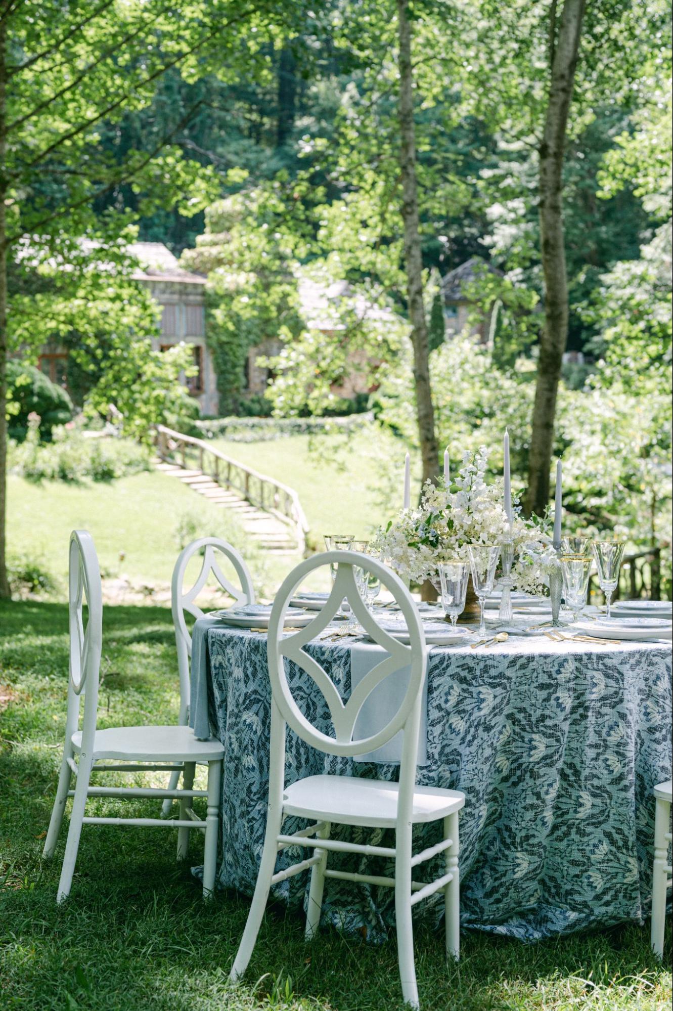
A layered place setting can establish the visual direction of a fall wedding before guests see the menu or the first course arrives. At the center of that composition are often two pieces: the charger plate and the stoneware placed above it.
Although the pairing may appear simple, the result depends on more than selecting two pieces in coordinating autumn colors. The charger must remain visible beneath the dinner plate, the finishes should balance rather than compete, and the complete stack must fit comfortably within the space assigned to each guest.
The strongest combinations also reflect fall without relying on predictable seasonal motifs. A warm metallic edge, moss-toned plate, sculpted border, or grounded neutral may provide enough seasonal character when the remaining layers are kept restrained.
Before selecting a charger and stoneware combination for a Charleston fall wedding, consider how the pieces relate in size, visual weight, shape, texture, and function. Testing these details together can create a place setting that looks refined in photographs and continues to work throughout meal service.
Begin With the Charger’s Visible Rim

A charger can only contribute to the design when enough of it remains visible beneath the dinner plate. Its outer edge frames the stoneware, defines the size of the place setting, and creates separation between the dinnerware and the table or linen beneath it.
For this reason, a charger should not be chosen from an individual product image without also considering the dimensions and shape of the plate that will sit above it.
Check How Much of the Charger Will Show
Place the proposed dinner plate directly on the charger and examine the remaining border. The visible area should be wide enough to reveal the detail that makes the charger distinctive.
That detail might be:
-
A metallic edge
-
A sculpted or floral outline
-
A woven surface
-
A colored border
-
A matte finish
-
A glass or reflective texture
When only a very narrow edge remains visible, the charger may not add enough visual value to justify its place in the setting. A different charger, or a stoneware plate with a smaller diameter, may create a clearer relationship between the layers.
The goal is not to expose as much of the charger as possible. Instead, enough of its design should remain visible to create an intentional frame around the stoneware.
Identify Where the Charger’s Detail Appears
Not all chargers rely on the same part of the surface for their visual impact.
Some have a decorative border concentrated around the outer rim. Others use texture, pattern, or color across the full plate. A dinner plate may cover much of that interior detail, leaving only a simplified edge visible.
A charger with a strong perimeter design can work effectively beneath broad stoneware because its defining feature remains exposed. A charger that relies on a pattern across the center may lose much of its character once the place setting is assembled.
Reviewing where the detail appears helps determine whether the combination will look as effective on the table as it does when the pieces are viewed separately.
Avoid Selecting the Charger in Isolation
A standard charger diameter does not guarantee that it will work equally well with every dinner plate.
Stoneware collections may differ in:
-
Overall diameter
-
Rim width
-
Curvature
-
Irregularity
-
Thickness
-
Shape
A plate with a broad rim may visually fill more of the charger than a similarly sized plate with a narrow edge. Handmade-looking stoneware can also appear larger because of its substantial form and irregular silhouette.
The exact charger and stoneware should therefore be tested together before rental quantities are finalized.
Balance Visual Weight Before Comparing Color

Color is often the first feature considered when pairing tabletop pieces, but visual weight can have a greater effect on whether the layers feel balanced.
Visual weight describes how prominent a piece appears because of its thickness, texture, pattern, outline, or finish. Two pieces can coordinate in color and still feel mismatched if one appears significantly stronger than the other.
Pair Substantial Stoneware With a Clear Foundation
Stoneware often has a grounded, tactile appearance. Its visible thickness, glaze variation, or handmade character can give it more visual presence than delicate porcelain.
When the stoneware is substantial, the charger beneath it should remain clearly defined. Suitable directions may include:
-
A broad matte surface
-
A visible metallic rim
-
A strong contrasting tone
-
A structured geometric edge
-
A noticeable woven texture
A delicate charger with a narrow or indistinct border may disappear beneath heavier stoneware. The place setting can then look as though the charger was added without contributing to the overall composition.
The foundation does not need to be ornate, but it should have enough presence to support the plate above it.
Use Contrast Between Matte and Reflective Finishes
Finish provides a subtle way to create separation between the charger and stoneware.
Matte or softly glazed stoneware can be paired with a charger that introduces controlled reflection through metal, glass, or a polished border. The contrast helps the outline of the charger remain visible and prevents the setting from appearing flat.
Stoneware with a more pronounced glaze may benefit from a quieter charger. A matte, woven, or restrained metallic finish can provide definition without introducing another highly reflective surface.
The relationship should be visible without becoming distracting. A small amount of contrast is often enough to distinguish the layers.
Know When Both Pieces Are Too Textural
Texture gives a place setting depth, but too many strong surfaces can make a small area feel crowded.
For example, irregular stoneware placed over a deeply woven, carved, or highly patterned charger may cause both pieces to compete for attention. Neither element is given enough visual space to stand out.
When one layer has a pronounced texture, use the other as a calmer frame. Substantial stoneware may work best over a charger with a clean shape and controlled finish. A highly textured charger can be paired with simpler stoneware that allows its perimeter to remain the primary detail.
Use Shape to Control the Plate Stack
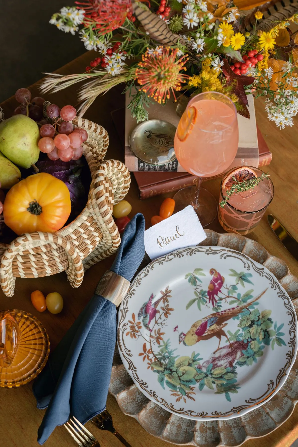
The relationship between shapes affects whether the place setting feels cohesive, architectural, playful, or visually unsettled.
Shape contrast can be effective, but it should be introduced deliberately. The charger and stoneware should look like coordinated layers rather than pieces selected from unrelated tabletop concepts.
Repeat the Shape for a More Unified Setting
A round charger paired with round stoneware creates a consistent and familiar frame. It is also relatively easy to repeat across long tables or a large reception.
Matching the general shape does not mean the pieces must look identical. The combination can still create interest through:
-
Contrasting colors
-
Different finishes
-
A decorative charger edge
-
Glaze variation
-
A subtle pattern
-
Changes in texture
This approach may be especially effective when the wedding design already includes patterned linens, distinctive florals, or colored glassware. The repeated shape gives the place setting a stable foundation without introducing another competing outline.
Introduce Shape Contrast Deliberately
Shape contrast can make the charger more noticeable. A floral, scalloped, geometric, or square charger may create a distinctive outline beneath simple round stoneware. Conversely, irregular stoneware can be placed over a restrained round charger that contains the more expressive plate shape.
Avoid combining two highly decorative outlines unless they have a clear visual relationship. A heavily sculpted charger beneath dramatically irregular stoneware may make the stack feel busy, even when the colors coordinate.
One layer should usually establish the dominant shape while the other provides structure.
Recenter Irregular Pieces by Eye
Stoneware with an organic or handmade-looking edge may not appear centered when aligned strictly by measurement.
The plate may be physically centered while one side appears heavier or extends farther because of its irregular shape. Review the combination from the guest’s seated position and make small adjustments until it looks balanced.
This visual check is particularly important when the upper plate contains an asymmetrical glaze, rim, or pattern. The place setting should appear composed from the angle guests will actually see.
Place the Fall Reference in One Primary Layer
A fall wedding place setting does not need to include rust, brown, gold, leaves, wood, and woven texture in every component.
A more refined design often gives one primary layer the strongest seasonal character and allows the other to provide contrast or structure. This approach keeps the table connected to the season without making it feel overly themed.
Let the Charger Carry the Seasonal Character
The charger can establish the fall direction through its visible border, material, or color.
Possible approaches include:
-
A warm metallic finish
-
A woven or natural-looking texture
-
A rich floral motif
-
A wood-toned surface
-
A deep, grounded color
-
A sculpted edge with traditional character
When the charger carries the strongest seasonal reference, quieter stoneware can help balance it. Cream, soft grey, taupe, or another restrained tone may allow the charger’s defining detail to remain visible.
Let the Stoneware Carry the Seasonal Character
Stoneware can provide the primary fall color or texture while the charger serves as a polished frame.
Moss, taupe, charcoal, cream, or other grounded tones can introduce seasonal depth without depending on literal fall imagery. Glaze variation and tactile surfaces can also add warmth to the setting.
In this arrangement, the charger may be metallic, transparent, neutral, or minimally patterned. Its role is to contain and elevate the stoneware rather than introduce a second strong seasonal statement.
Keep the Supporting Layer Restrained
Decide whether the charger or stoneware will be the dominant piece.
The dominant layer might carry the strongest: You may also find Tips for Renting Elegant Tableware and Flatware for Weddings helpful.
-
Color
-
Pattern
-
Texture
-
Shape
-
Reflective finish
The supporting layer should create separation without competing. Keeping one piece restrained also leaves room for the napkin, glassware, flatware, and floral design to contribute to the table. For more detail, see our article The Ultimate Guide to Renting Event Chargers for Elegant Table Settings.
This balance is particularly important for a fall wedding because warm colors and tactile materials can quickly accumulate across the full tablescape. We cover this further in Fall Tabletop & Glassware Rentals in Charleston, SC.
Determine What Guests Will See at Arrival

The initial plate stack should be based on the meal and service plan rather than the number of layers that look attractive in a styled photograph.
Some plates may be preset, while others may arrive with individual courses. The caterer, planner, and rental consultant should confirm how the table will function before the final stack is approved.
Build the Stack Around the Actual Menu
Determine which pieces genuinely need to appear when guests enter the reception.
The initial arrangement may include:
-
The charger only
-
A charger and dinner plate
-
A charger, dinner plate, and salad plate
-
A bowl or specialty plate
-
A decorative top plate with a defined presentation purpose
Avoid adding plates simply to make the setting appear fuller. An unnecessary layer may need to be removed immediately, creating additional work for the service team and disrupting the presentation.
The stack should support the meal sequence while still presenting a complete and intentional arrangement at arrival.
Decide Whether the Napkin Should Reveal or Conceal the Layers
Napkin placement can change how much of the stoneware and charger remains visible.
A napkin centered over the top plate may create a clean arrival presentation, but it can conceal a distinctive glaze, pattern, or plate shape. A narrower fold may allow more of the stoneware to show.
Other options include placing the napkin:
-
Between two plate layers
-
Across only part of the top plate
-
Beside the charger
-
Beneath a menu or place card
The napkin should support the charger-and-stoneware pairing rather than hide the defining features of both pieces.
Confirm When the Charger Will Be Removed
Chargers are typically presentation pieces rather than surfaces from which food is served. The catering team should confirm when they will be removed and which plate will replace or rest above them during each course.
This timing affects whether menus, place cards, favors, or napkins can remain on the charger. It also determines how the setting will look after the first layer is cleared.
Planning the transition helps preserve the table’s visual continuity throughout dinner rather than concentrating all styling effort on the arrival setting.
Test the Pairing at Full Scale
Product images are useful for reviewing color and individual details, but they cannot show how the combination will function on the selected reception table.
A full-scale test should include the other preset elements, the available space, and at least one neighboring place setting.
Assemble Every Preset Element
Create one complete place setting using the proposed:
-
Charger
-
Stoneware
-
Napkin
-
Menu or place card
-
Flatware
-
Glassware
-
Linen or exposed tabletop
The purpose is not to redesign every tabletop category at once. These pieces are included to determine whether the charger and stoneware fit comfortably within the complete arrangement.
Check whether the charger leaves enough room for flatware and whether the glassware can be positioned without crowding the plate stack. A successful pairing must function within the full setting, not only when viewed alone.
Place Two Settings Beside Each Other
A single place setting can appear spacious on a large display table. The true scale becomes clearer when a second setting is placed beside it.
Review whether:
-
Charger edges sit too close together
-
Flatware overlaps adjacent settings
-
Glassware becomes compressed
-
Napkin folds extend too far outward
-
Each guest retains sufficient personal space
This test is especially valuable for long banquet or farm tables, where repeated chargers can occupy a significant portion of the surface.
Repeat the Test on the Selected Table Type
Table shape and width influence how well the pairing functions.
A broad charger-and-stoneware combination may fit comfortably on a wide rectangular table but feel crowded on a smaller round table with more guests. Table legs, centerpiece space, and glassware placement can also affect the available area.
Use the actual table dimensions and expected number of seats during the test. The setting should be evaluated under the same spatial conditions planned for the reception.
Create Consistency Without Making Every Table Identical

A Charleston wedding reception may include several table shapes, feature areas, or seating zones. Minor variations can be introduced without losing overall continuity.
The charger-and-stoneware relationship should remain recognizable throughout the room, even when one component changes.
Preserve One Repeating Anchor
Choose one element to repeat across all guest tables.
The anchor may be:
-
The same stoneware collection
-
The same charger
-
A consistent metallic edge
-
A repeated plate shape
-
The same color relationship
-
A shared matte or glazed finish
This repeated feature creates continuity and allows other small details to vary without making the room feel disconnected.
Vary One Component at a Time
When variation is part of the design, change only one major component between table groups.
For example, the stoneware might remain consistent while two compatible charger styles alternate across the room. Another approach is to retain one charger while using a different top plate at a feature table.
Changing the charger, stoneware, glassware, and linen simultaneously can make each table feel like a separate concept. Controlled variation creates interest while preserving a unified reception design.
Reserve the Strongest Combination for a Feature Setting
The couple’s table or another focal setting may use a more distinctive version of the primary combination.
This could include:
-
A charger with a more decorative edge
-
An additional plate layer
-
Stronger color contrast
-
A more detailed top plate
-
A special napkin placement
The feature setting should still relate to the guest tables through color, finish, shape, or stoneware. It should feel elevated rather than unrelated.
Where Charger-and-Stoneware Pairings Break Down
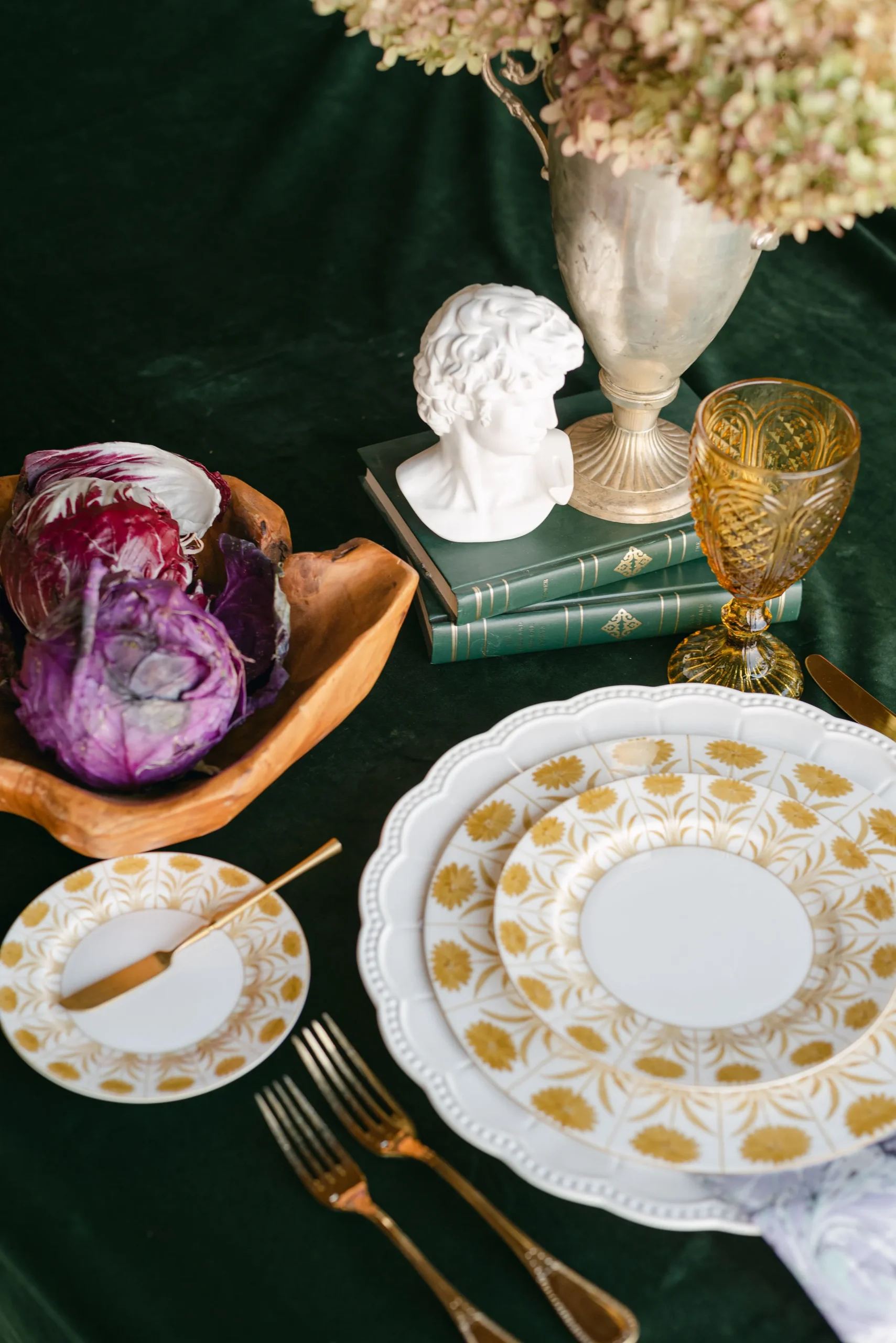
Before approving the final selection, check for a few common problems that can weaken the composition or complicate meal service.
The Dinner Plate Hides the Charger
A charger adds little to the place setting when nearly all of its defining detail is concealed.
If the visible edge is too narrow, consider changing the charger, choosing a smaller dinner plate, or selecting a charger with more prominent perimeter detail.
Both Pieces Compete for Attention
A highly patterned charger paired with heavily textured or irregular stoneware may make the place setting feel crowded.
Identify which piece should dominate, then simplify the shape, finish, or color of the supporting layer. The strongest pairings often combine one expressive piece with one quieter frame.
The Stack Is Styled Without a Service Plan
An elaborate stack may photograph well but become impractical if several layers must be removed before the meal begins.
Confirm the function of every preset plate and coordinate the charger-removal plan with the catering team. The place setting should support service rather than create an immediate reset after guests are seated.
Frequently Asked Questions
Should a charger match the stoneware?
No. The pieces should relate through color, finish, shape, texture, or visual weight, but they do not need to match exactly. Controlled contrast can make both layers more distinct.
Can matte stoneware be paired with a metallic charger?
Yes. A metallic charger can add definition and subtle reflection beneath matte stoneware. The finish should coordinate with the broader tabletop design without requiring every metal on the table to match exactly.
How much of the charger should remain visible?
Enough of the charger should show to reveal its defining edge, texture, pattern, or color. The exact amount depends on the diameter and shape of the stoneware placed above it.
How many plate layers should be preset?
Only plates that support the menu or serve a defined presentation purpose should be preset. The catering team should confirm which pieces will remain, be removed, or arrive with individual courses.
Can different chargers be used across the same reception?
Yes. A consistent stoneware collection, plate shape, color relationship, or finish can connect different charger styles and maintain continuity across the reception.
Create a Layered Setting That Works Beyond the Photograph
A successful charger-and-stoneware pairing is not determined by autumn color alone. The layers must work together in size, visual weight, shape, texture, and function. Curated Events has eight showrooms; find your nearest location.
Begin by checking how much of the charger remains visible beneath the stoneware. Decide which piece will carry the strongest seasonal detail, then use the other to provide contrast and structure. Build the plate stack around the actual menu and test the arrangement with every preset element on the selected table. Fresh additions to the collection are in New Arrivals.
Curated Events Charleston offers charger plates, stoneware, china, glassware, flatware, linens, and other tabletop rentals that can be coordinated as one complete place setting. When that setting is also reviewed within the complete autumn wedding rental plan, its colors, materials, and proportions can relate more naturally to the tables, chairs, lighting, and surrounding reception design.